
COLOUR COLLECTION No.3.
The form and colour of a Plain English kitchen create a unique space that sets the scene for a lifetime of timeless rituals: tying an apron, drinking tea, burning the toast. These rituals continue to inform and inspire Plain English’s evolving collection of bespoke paint colours, available exclusively to our customers. This collection was put together by creative director Kate Shaw, and Interior Designer Rita Konig.

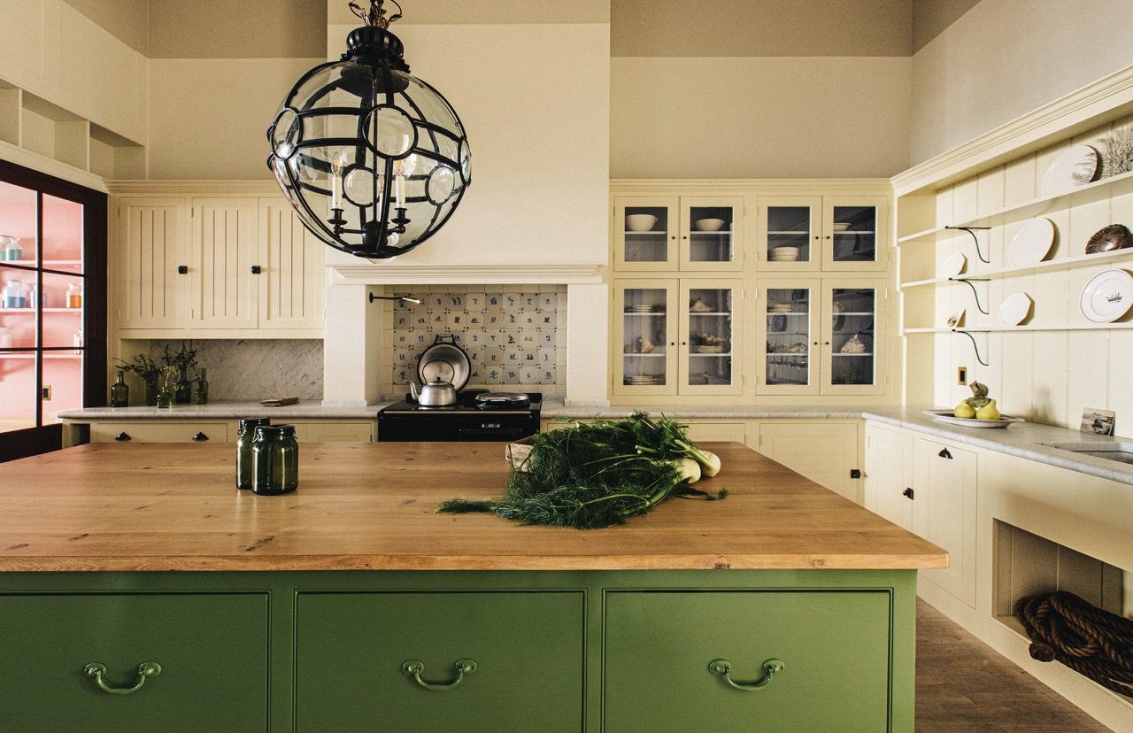
25. Moygashel
The sharp green of a field after rain, this colour was inspired by the village of Moygashel in County Tyrone, Northern Ireland.
View examples

26. Cotton Pinny
A bleached-out, crispy clean blue inspired by the pinafore, traditionally worn to protect buttons and delicate fabric from corrosive soaps and detergents.
View examples

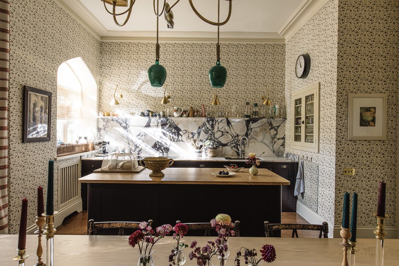
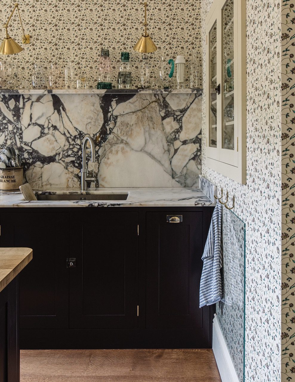
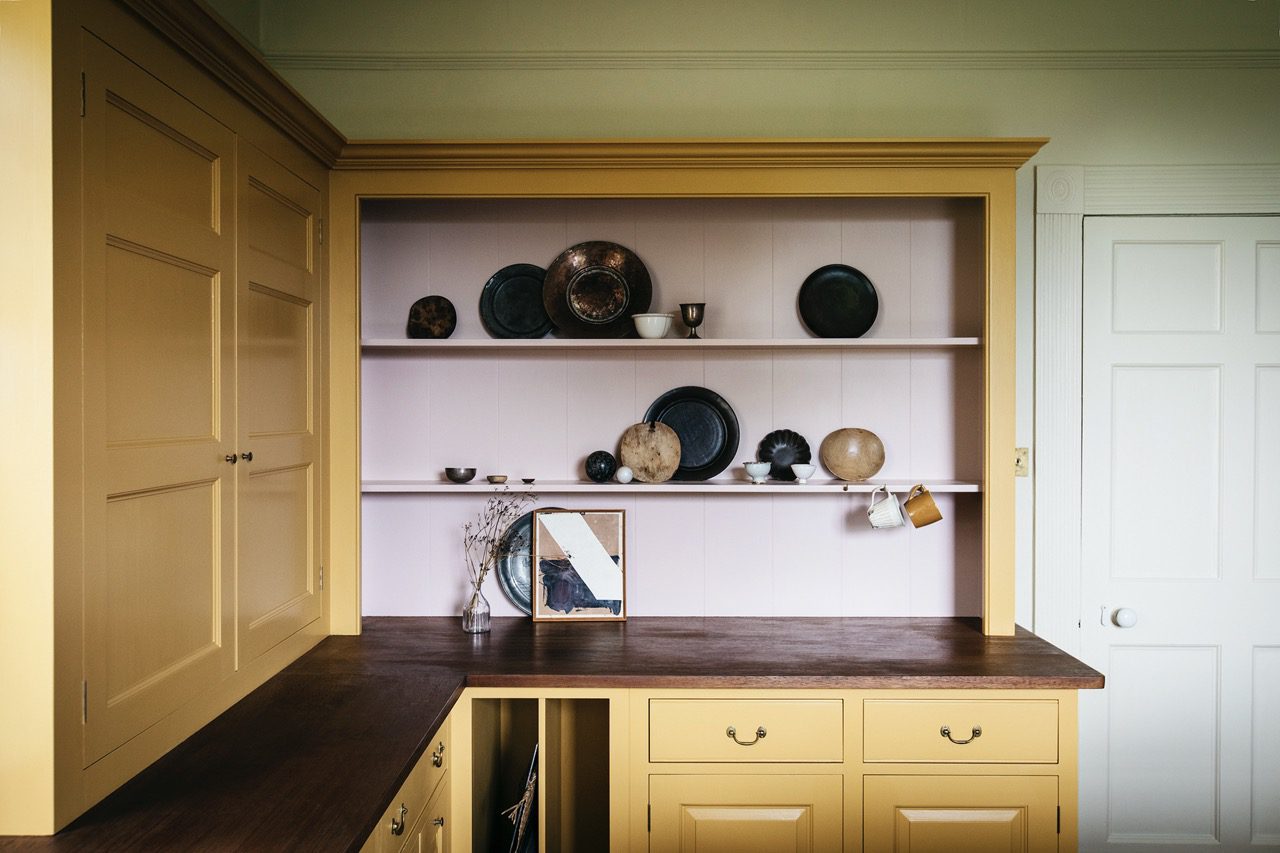
27. Mouldy Plum
A mercurial shade inspired by the seasonal bounty of the British plum tree.
View examples

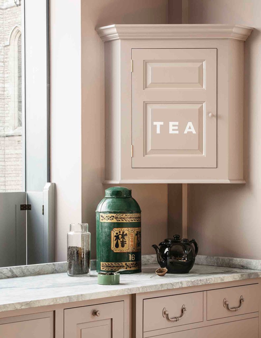
28. Tea Caddy
Inspired by the distinct blue found on an early 19c Chinese tea caddy, this vibrant hue celebrates the familiar ritual of tea making.
View examples

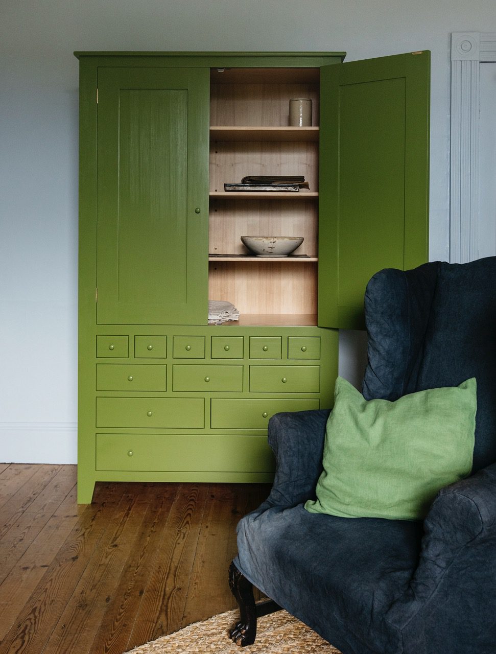
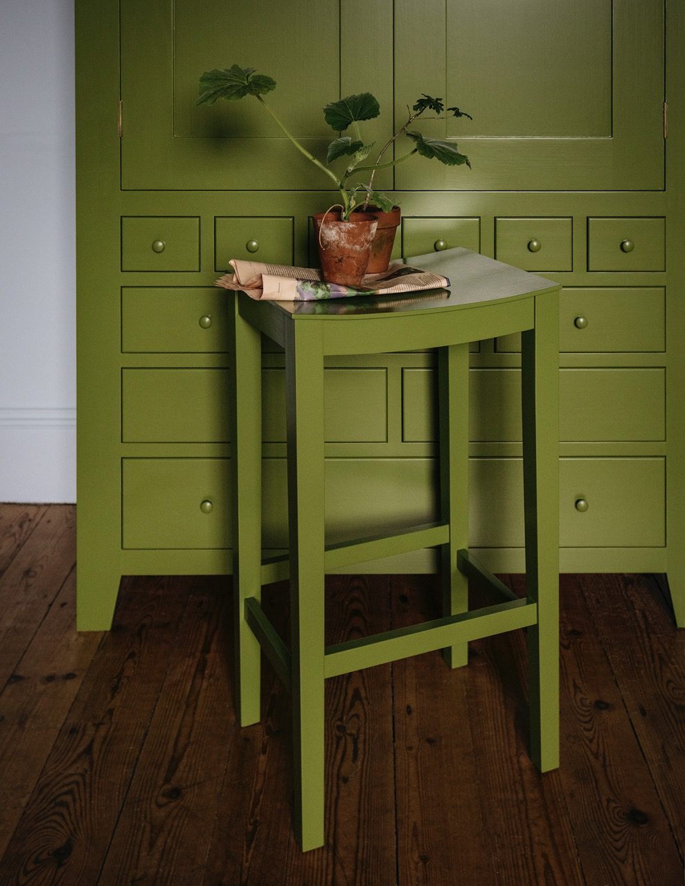
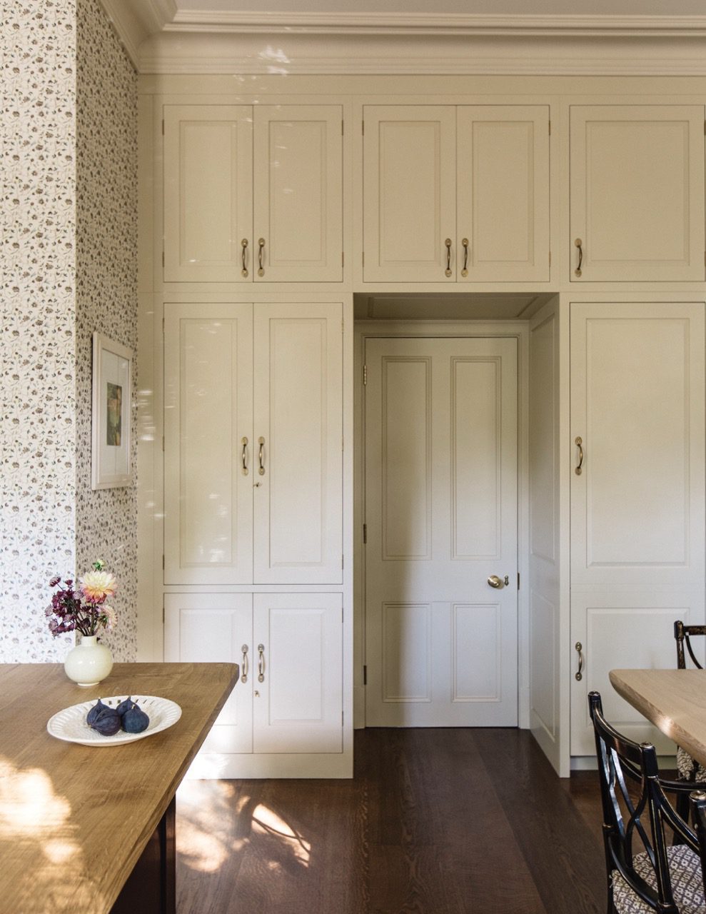
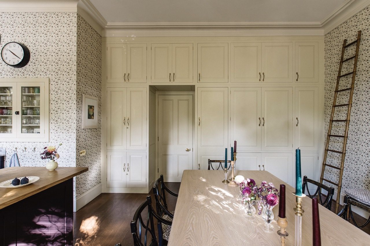
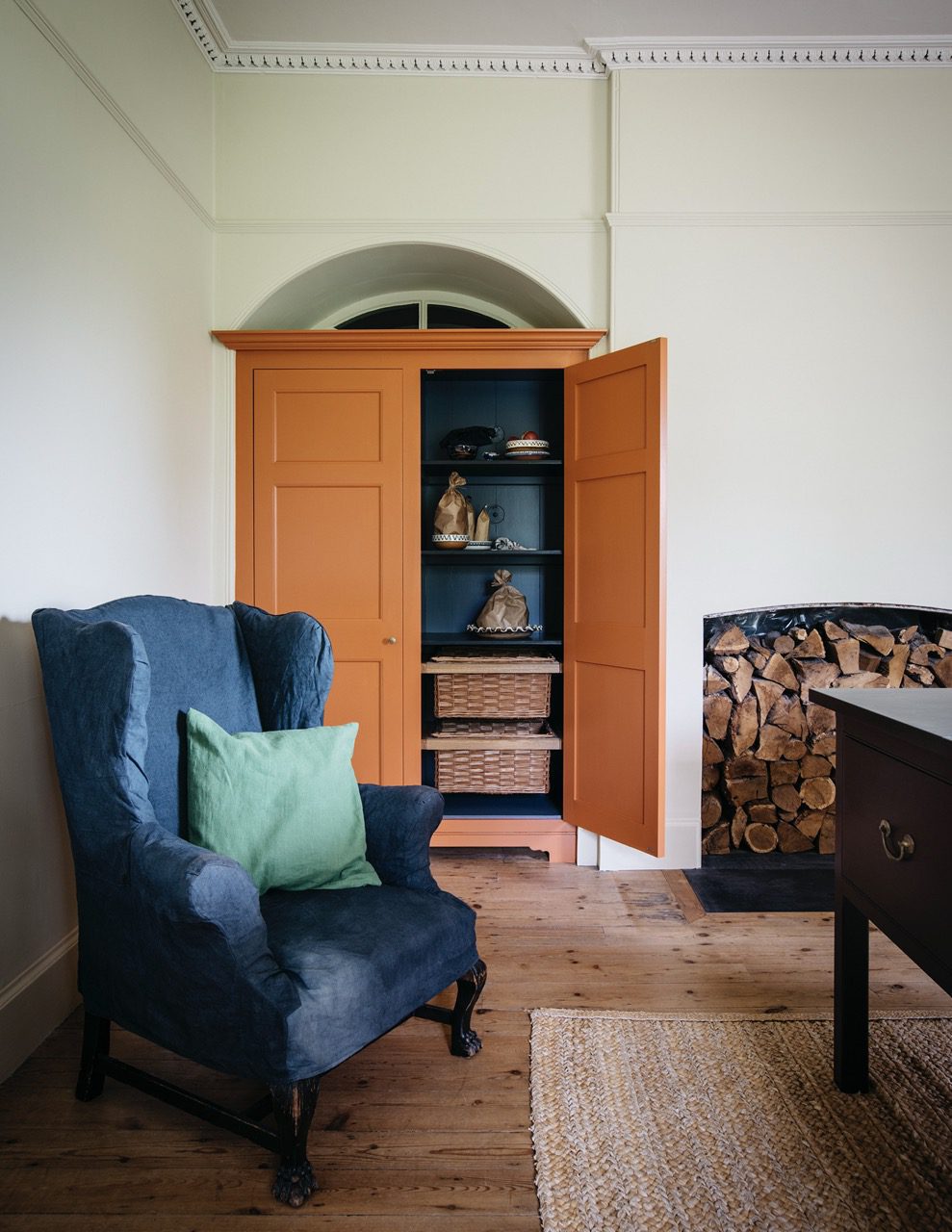
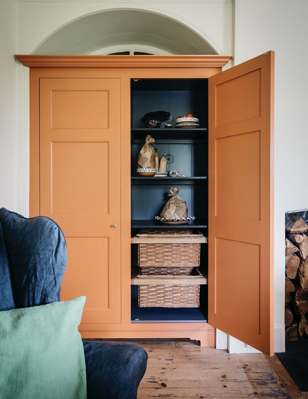
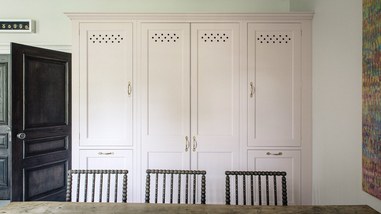
29. Flummery
This weathered neutral is named after the starchy, soft pudding that first appeared in Gervase Markham’s 1623 handbook.
View examples

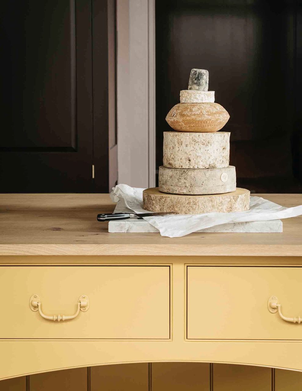
30. Burnt Toast
The nostalgic aroma of burnt toast is captured in this dense and complex colour.
View examples

31. Rubbing Brick
A rich, rusty red that takes its name from a Georgian brickwork technique in which soft clay bricks were tapered by hand.

32. Candied Peel
A soft orange, inspired by the sticky-sweet, preserved peel confection.
View examples

33. Nicotine
This lived-in murky gold speaks of storied interiors, where the fug of tobacco has long since faded.
View examples

34. Medlar Jelly
This strong orange takes its name from the glowing Victorian preserve, best served with roasted game.
View examples

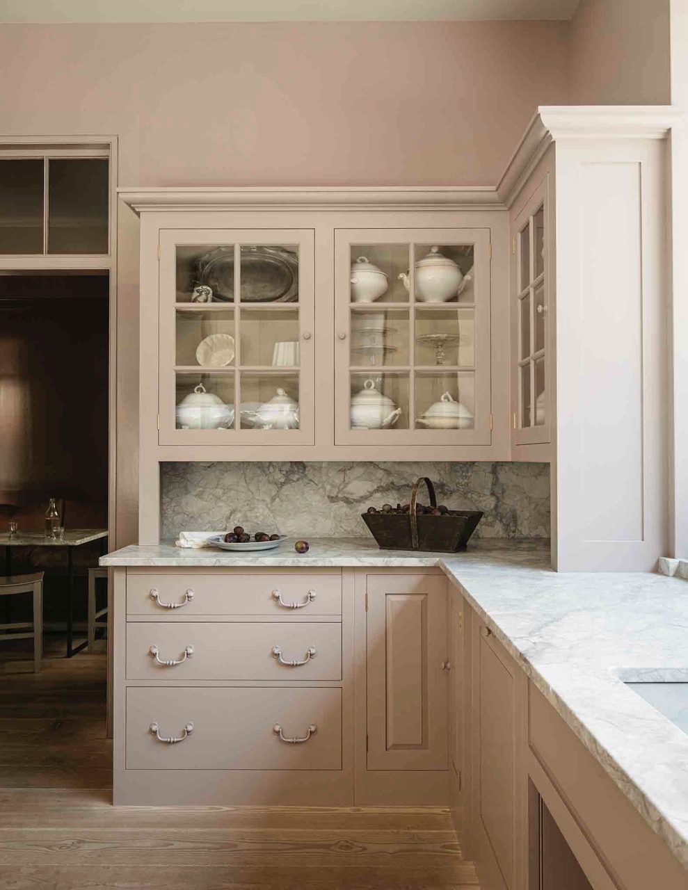
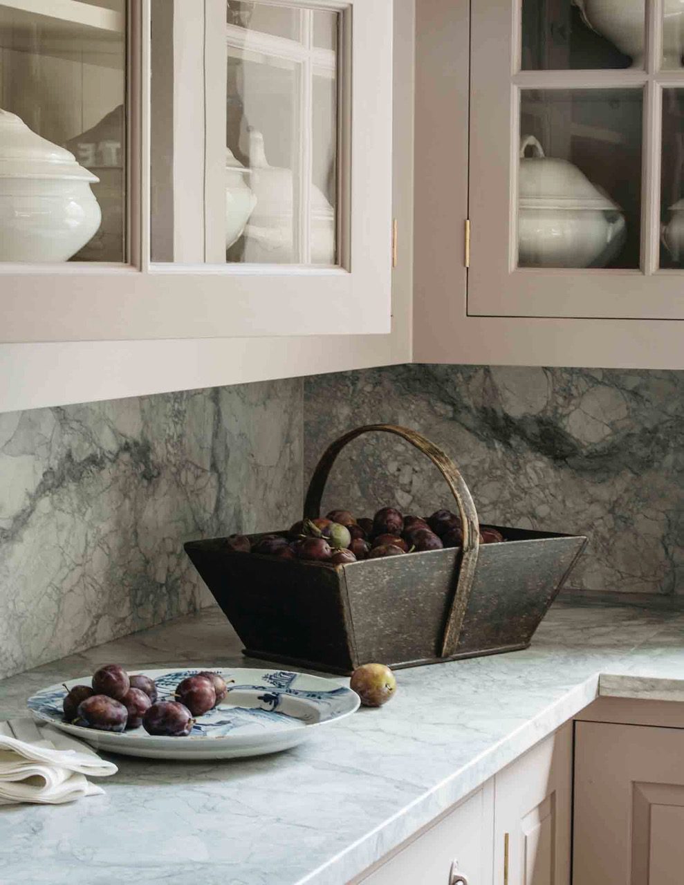
35. Silver Polish
Inspired by the gentle, chalky pink of Goddard’s liquid silver polish.
View examples

36. Bib and Braces
This subdued blue references the faded indigo aprons, overalls and boiler suits worn daily by farmers, craftsmen and mechanics since the 1800s.
View examples
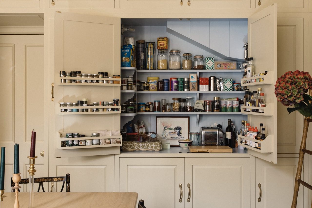
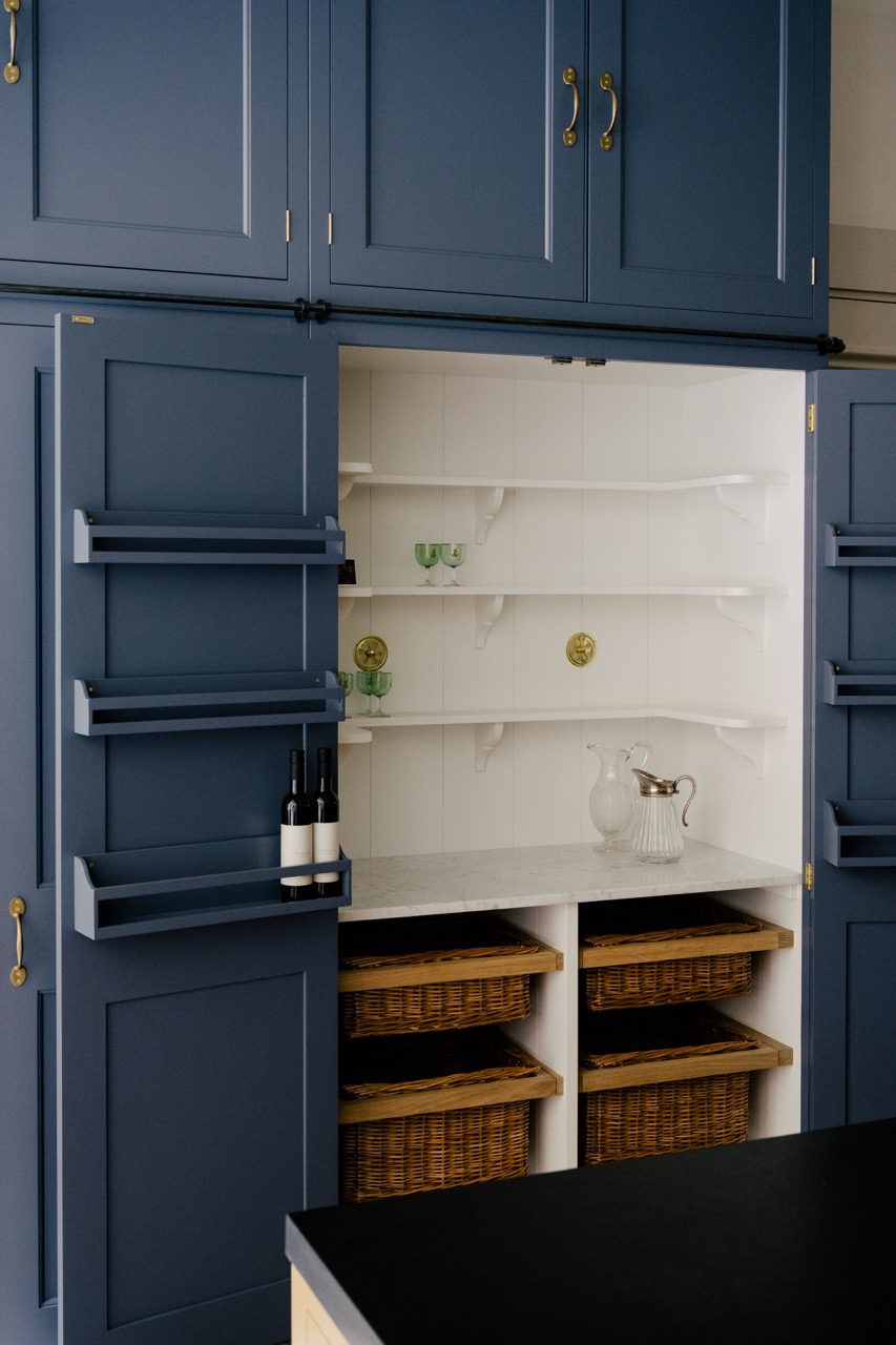
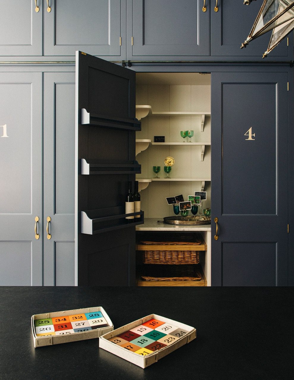
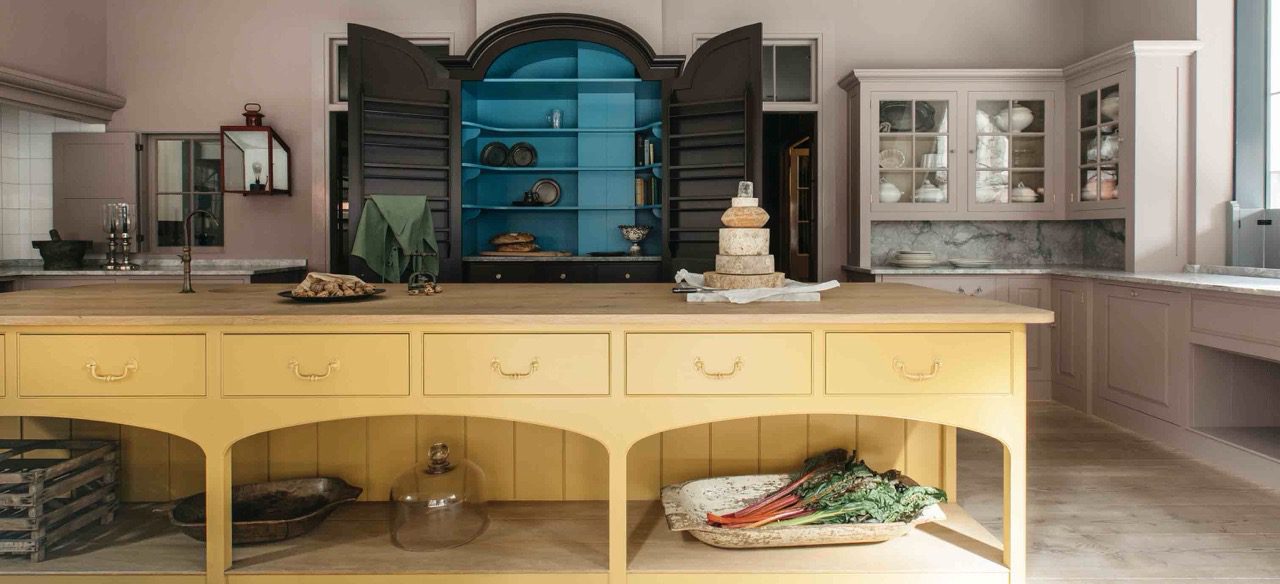
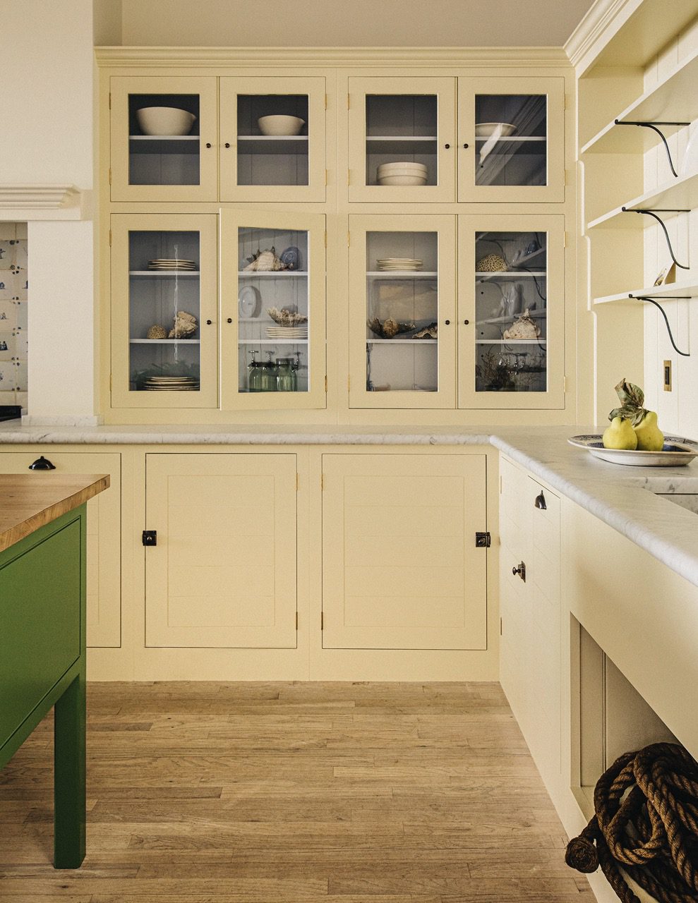
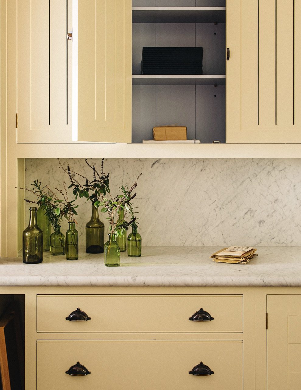
27. Mouldy Plum
Cupboards and walls here painted in ‘Mouldy Plum’. Interior of glazed cupboards painted in ‘Flummery’.
Cupboards and walls here painted in ‘Mouldy Plum’. Interior of glazed cupboards painted in ‘Flummery’.
Cupboards and walls here painted in ‘Mouldy Plum’. Interior of glazed cupboards painted in ‘Flummery’.
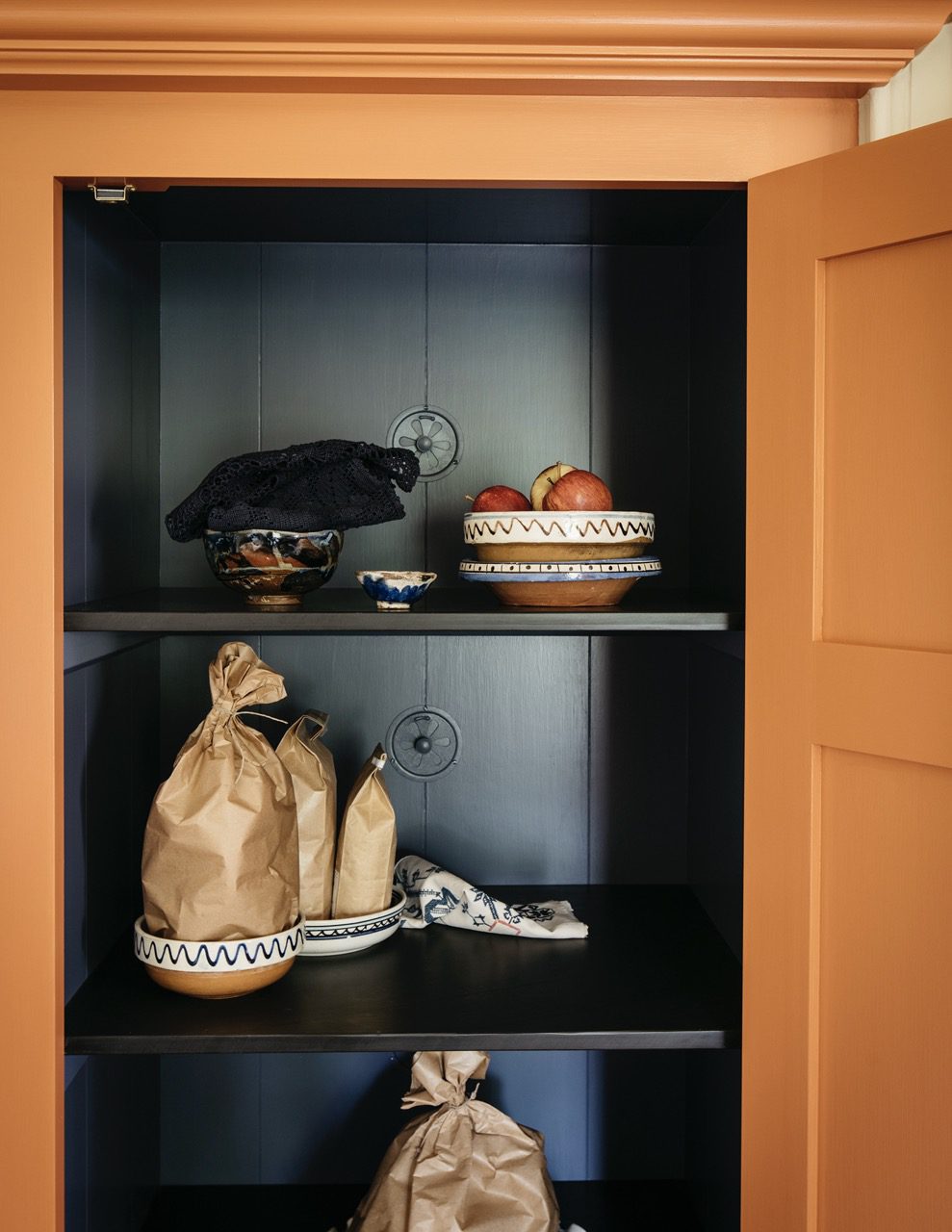
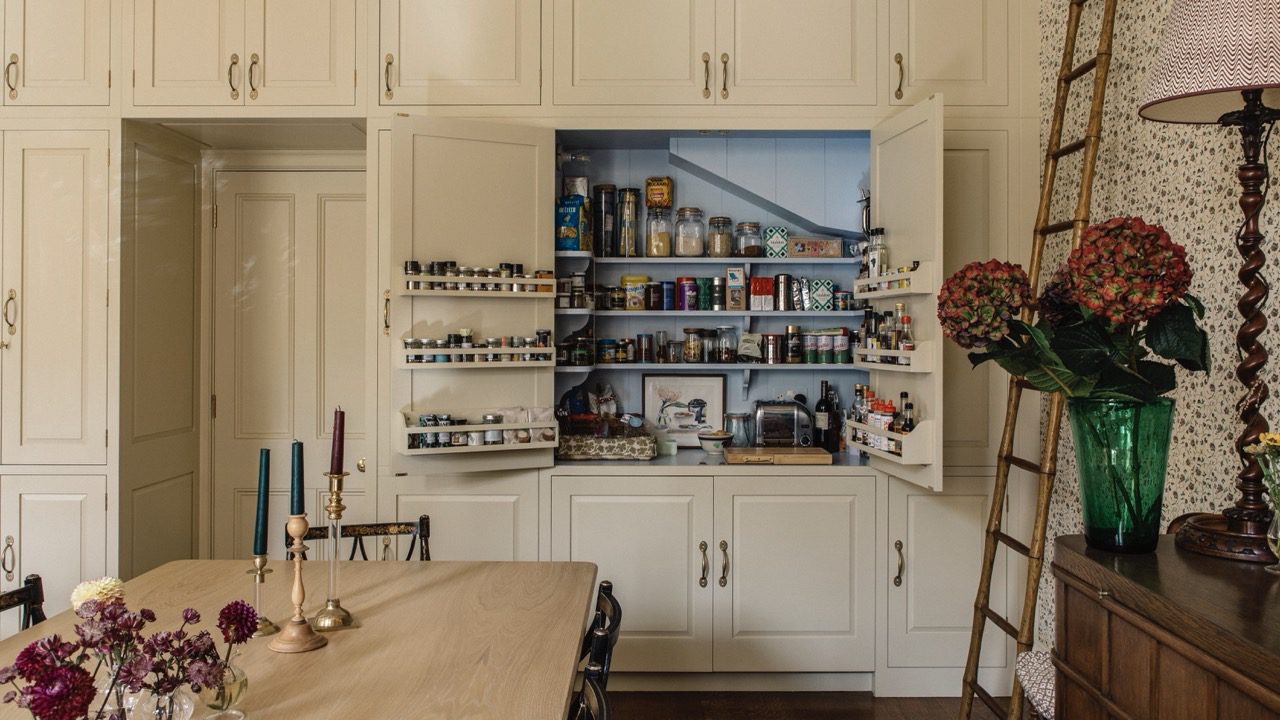
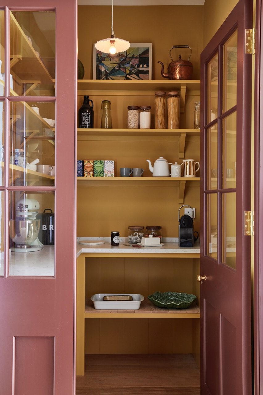
28. Tea Caddy
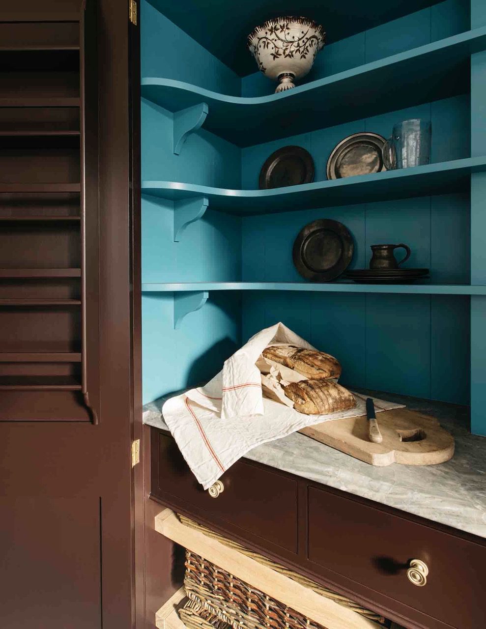
The interior of our Dutch Larder here painted in ‘Tea Caddy’, with the exterior painted in ‘Burnt Toast’.
The interior of our Dutch Larder here painted in ‘Tea Caddy’, with the exterior painted in ‘Burnt Toast’. Bath Dresser painted in Nicotine.
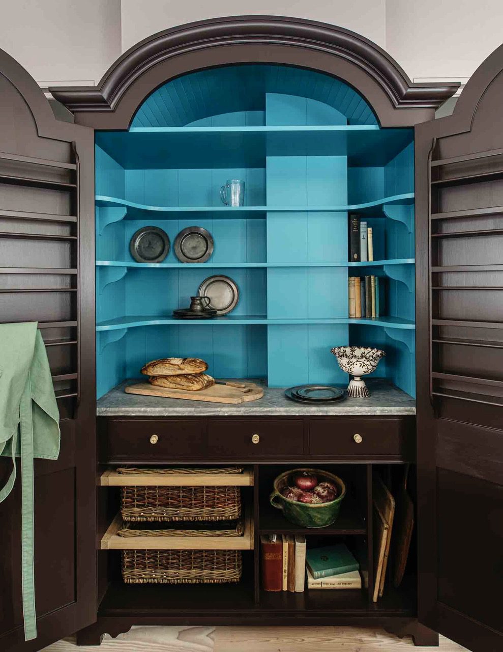
The interior of our Dutch Larder here painted in ‘Tea Caddy’, with the exterior painted in ‘Burnt Toast’.

The interior of our Dutch Larder painted in ‘Tea Caddy’, with the exterior painted in ‘Burnt Toast’.
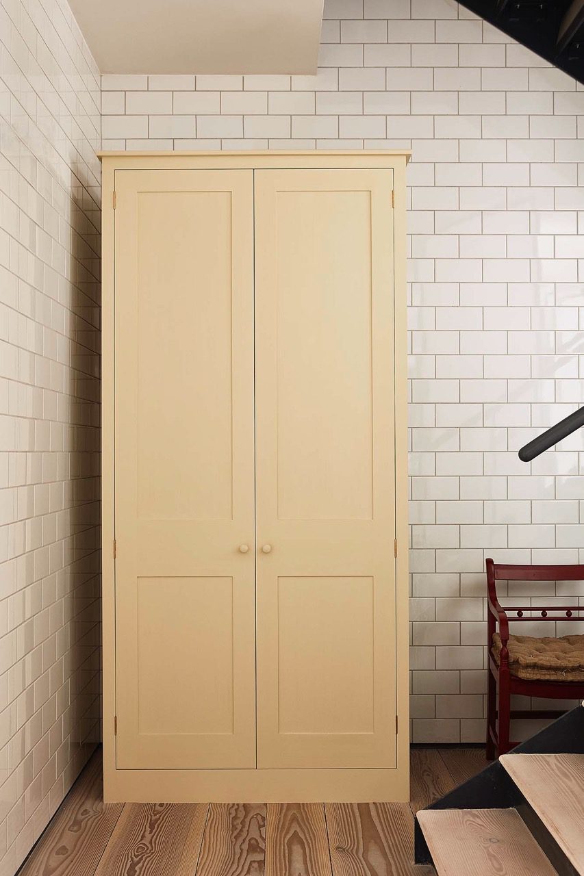
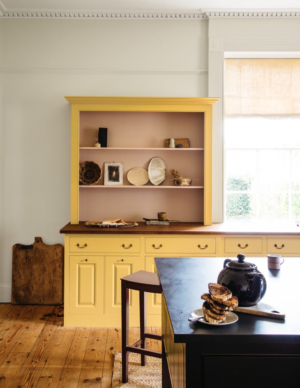
29. Flummery
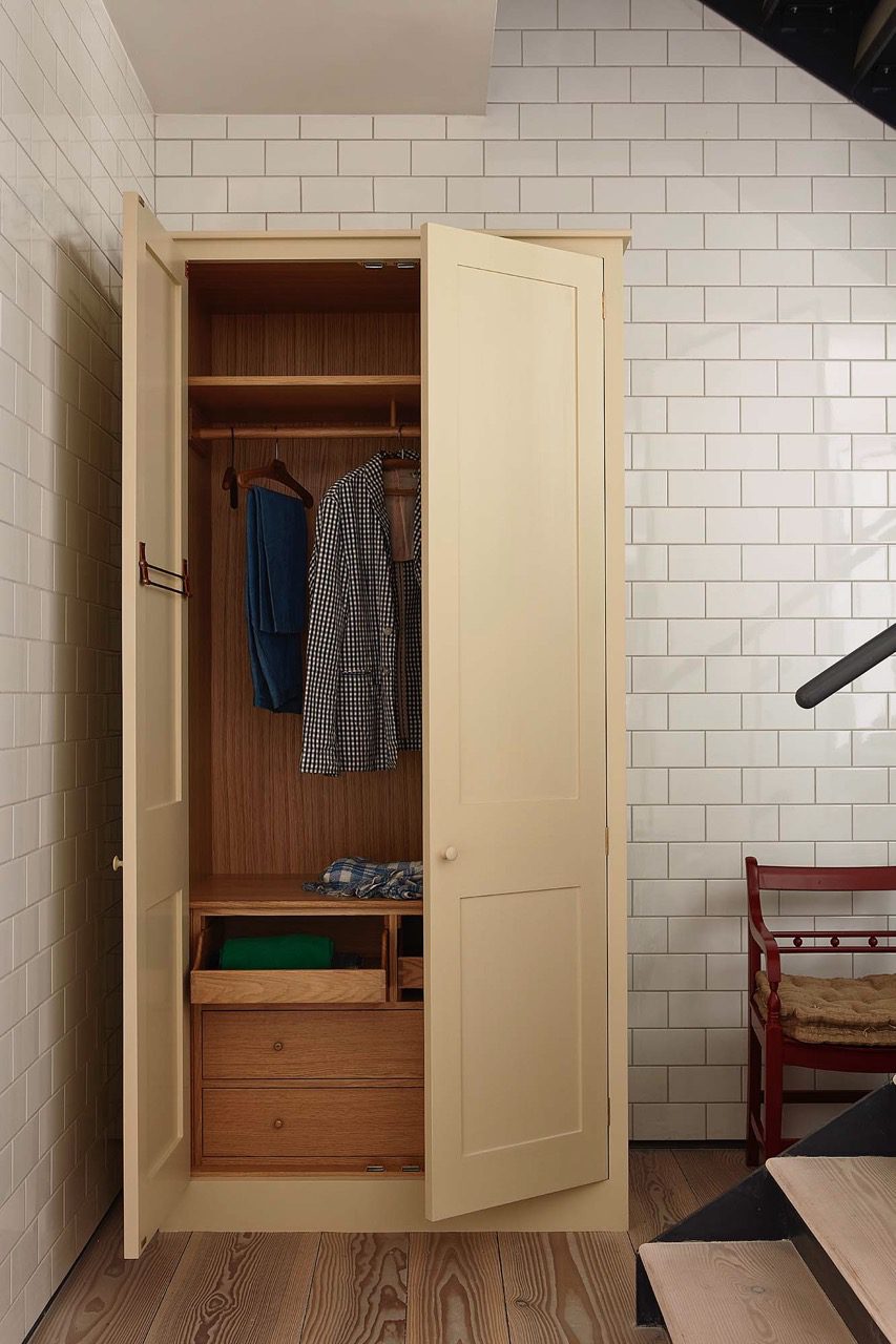
Wardrobe exterior painted in ‘Flummery’, with Oak interior.
Wardrobe exterior painted in ‘Flummery’.
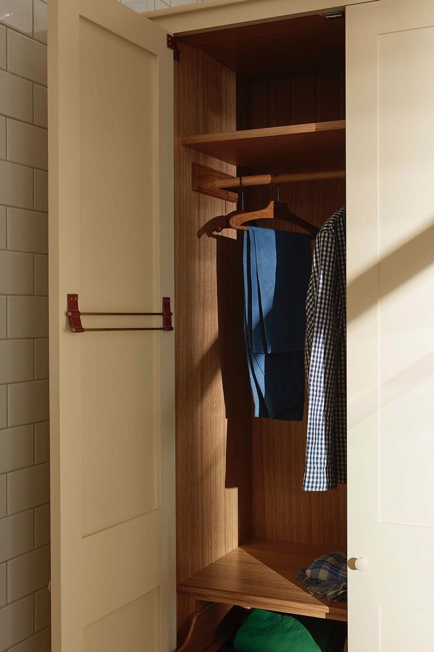
Wardrobe exterior painted in ‘Flummery’, with Oak interior.
30. Burnt Toast
The interior of our Dutch Larder here painted in ‘Tea Caddy’, with the exterior painted in ‘Burnt Toast’. Bath Dresser painted in Nicotine.
The interior of our Dutch Larder here painted in ‘Tea Caddy’, with the exterior painted in ‘Burnt Toast’.
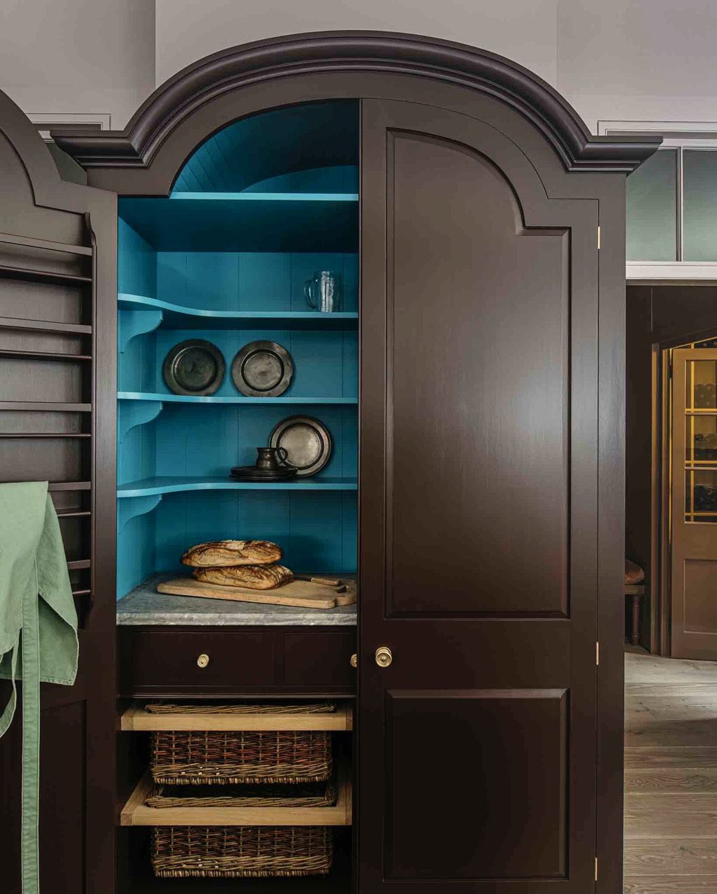
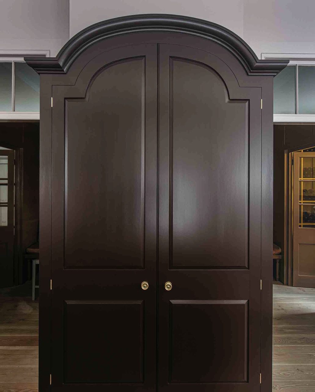
The Dutch Larder painted in ‘Burnt Toast’.

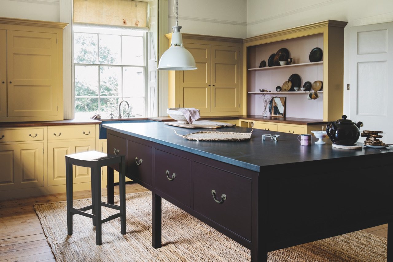
The Dutch Larder painted in ‘Burnt Toast’, with the Worktable painted in ‘Nicotine’. Walls, floor and wall cupboards painted in ‘Mouldy Plum’.

The worktable here painted in ‘Burnt Toast’ with the surrounding cupboards painted in ‘Nicotine’.

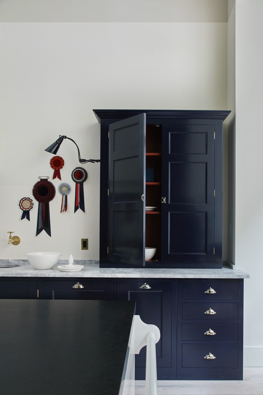
33. Nicotine
The Bath Dresser painted in ‘Nicotine’, with the Dutch Larder behind painted in ‘Burnt Toast’.
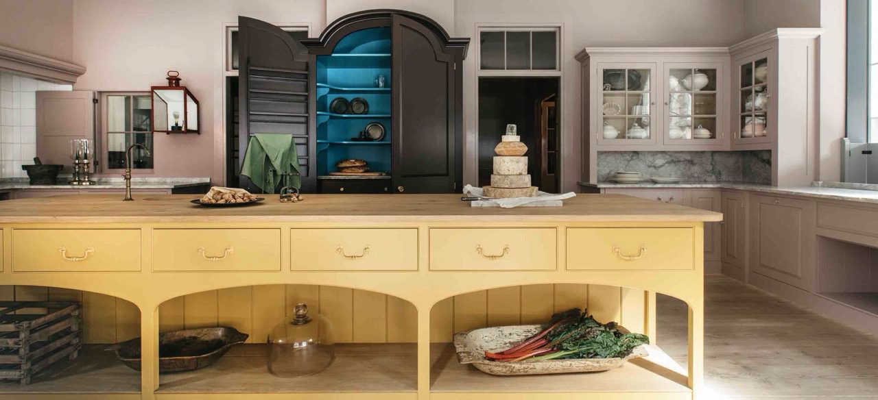
The Bath Dresser painted in ‘Nicotine’. The Dutch Larder behind painted in ‘Burnt Toast’ with the interior painted in ‘Tea Caddy’. Surrounding walls, wall and floor cupboards painted in ‘Mouldy Plum’.
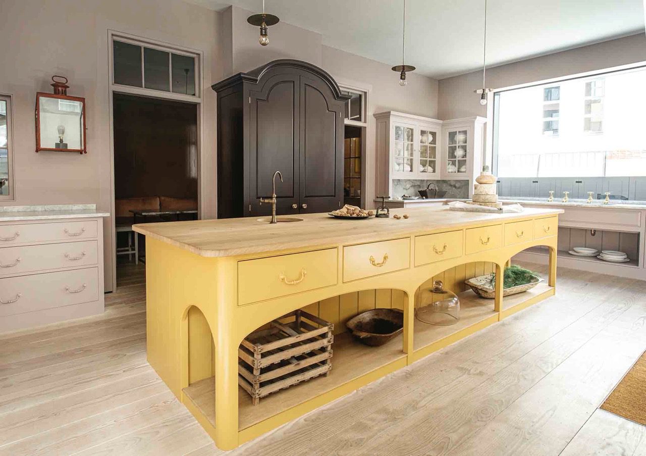
The Bath Dresser painted in ‘Nicotine’. The Dutch Larder behind painted in ‘Burnt Toast’. Surrounding wall and floor cupboards painted in ‘Mouldy Plum’.
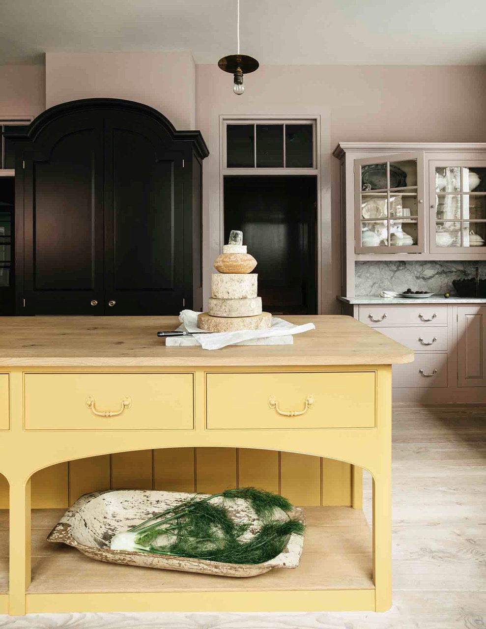
The Bath Dresser painted in ‘Nicotine’. The Dutch Larder behind painted in ‘Burnt Toast’. Surrounding wall and floor cupboards painted in ‘Mouldy Plum’.
A project with Sarah Brown Interiors. Interior of the larder here painted in ‘Nicotine’ with exterior in ‘Chop’.
35. Silver Polish


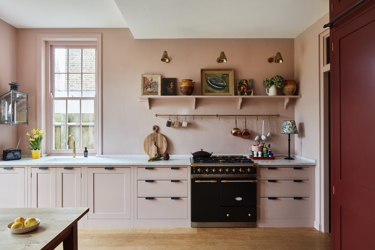
A project with Sarah Brown Interiors. Walls and cupboards here painted in ‘Silver Polish’.
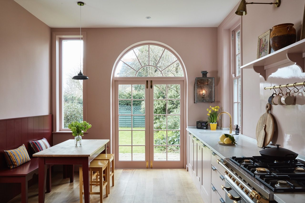
A project with Sarah Brown Interiors. Walls and cupboards here painted in ‘Silver Polish’, with the Bench Seat painted in ‘Chop’.
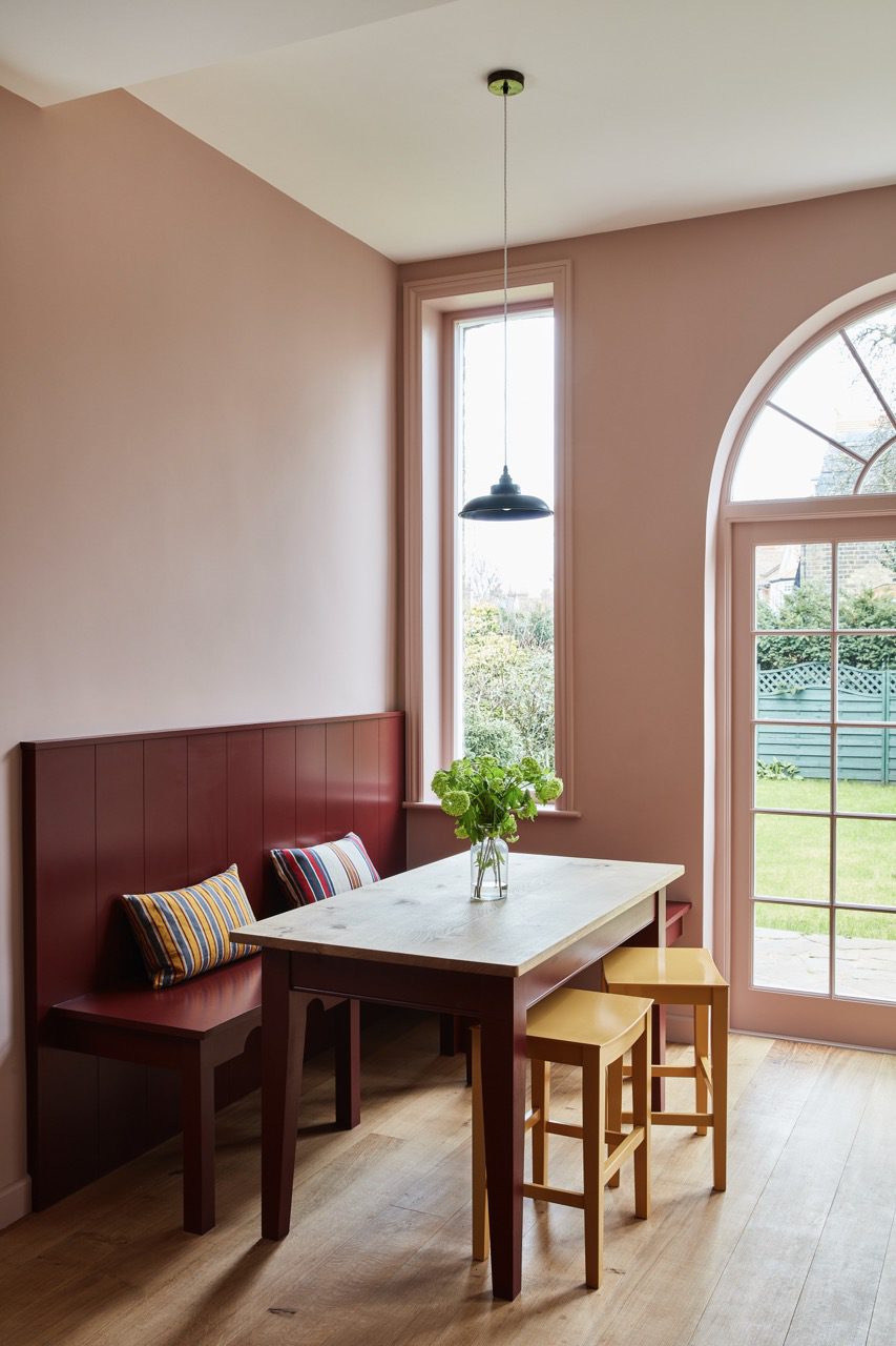
A project with Sarah Brown Interiors. Walls here painted in ‘Silver Polish’, with the Bench Seat painted in ‘Chop’.