

COLOUR COLLECTION No.2
Our second range of colours draw inspiration from the linoleum corridors and the wallpapered parlours, breakfast rooms and nurseries of an imagined 18th century home. At the same time we’ve given a nod to the municipal buildings of the same period; the town halls, schools and institutions. Grave, dignified buildings, honestly engineered, and severely but handsomely decorated with restraint and gravitas. This collection was put together by Adam Bray & Sue Skeen.
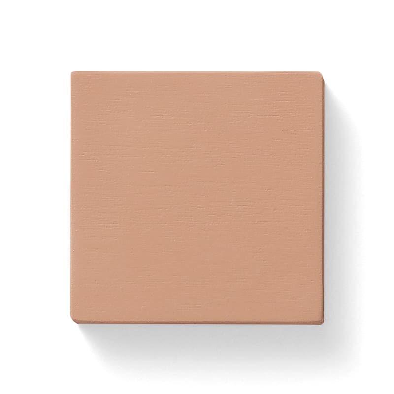
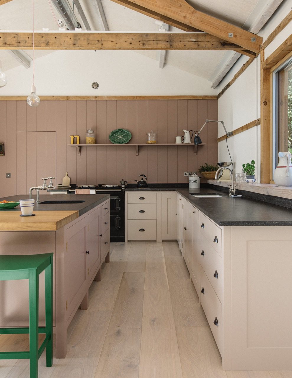
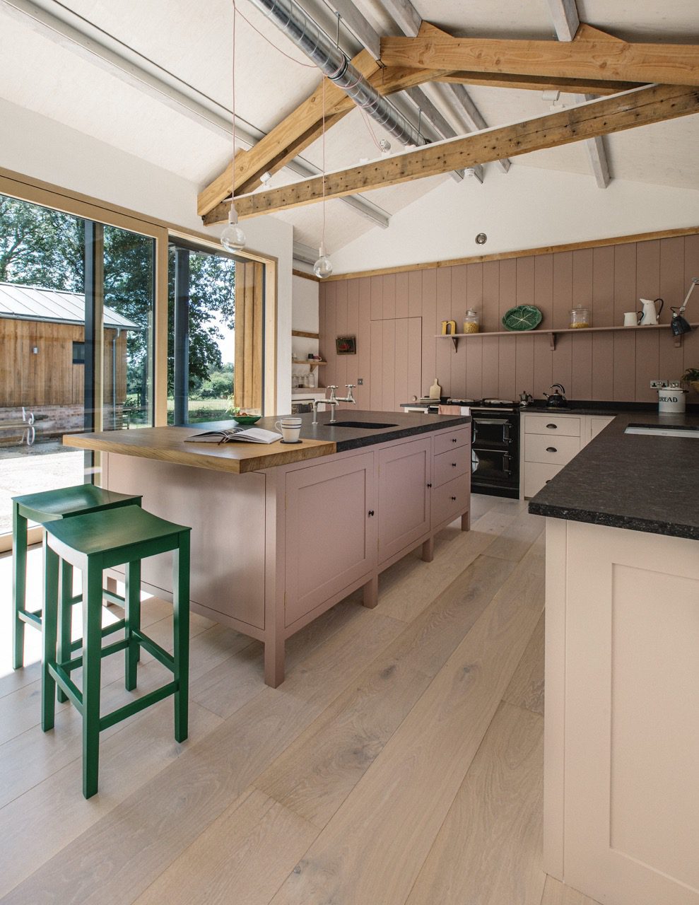
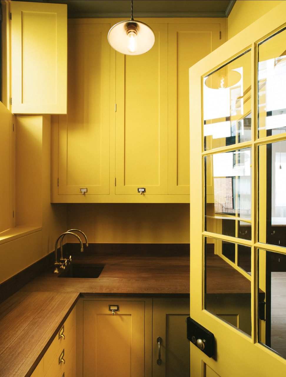
13. Kipper
Soft and smokey with a pinkish glow, a rare but satisfying breakfast staple.
View examples
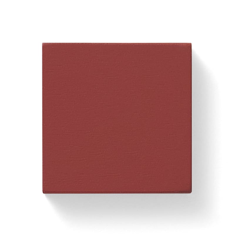
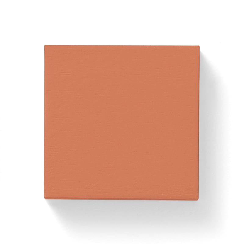
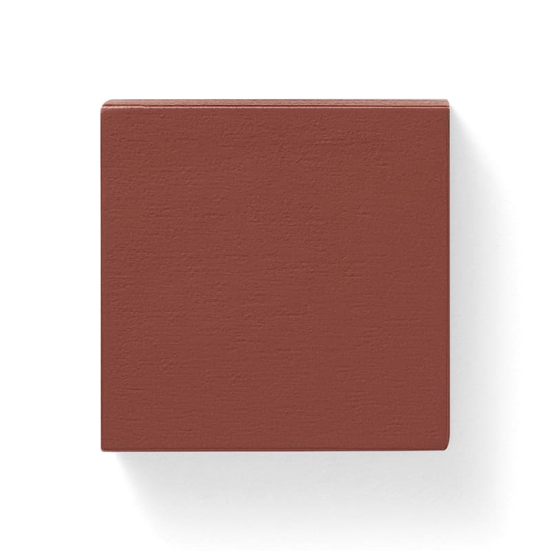
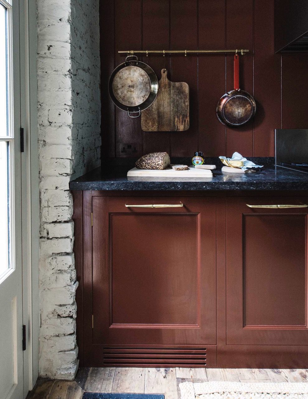
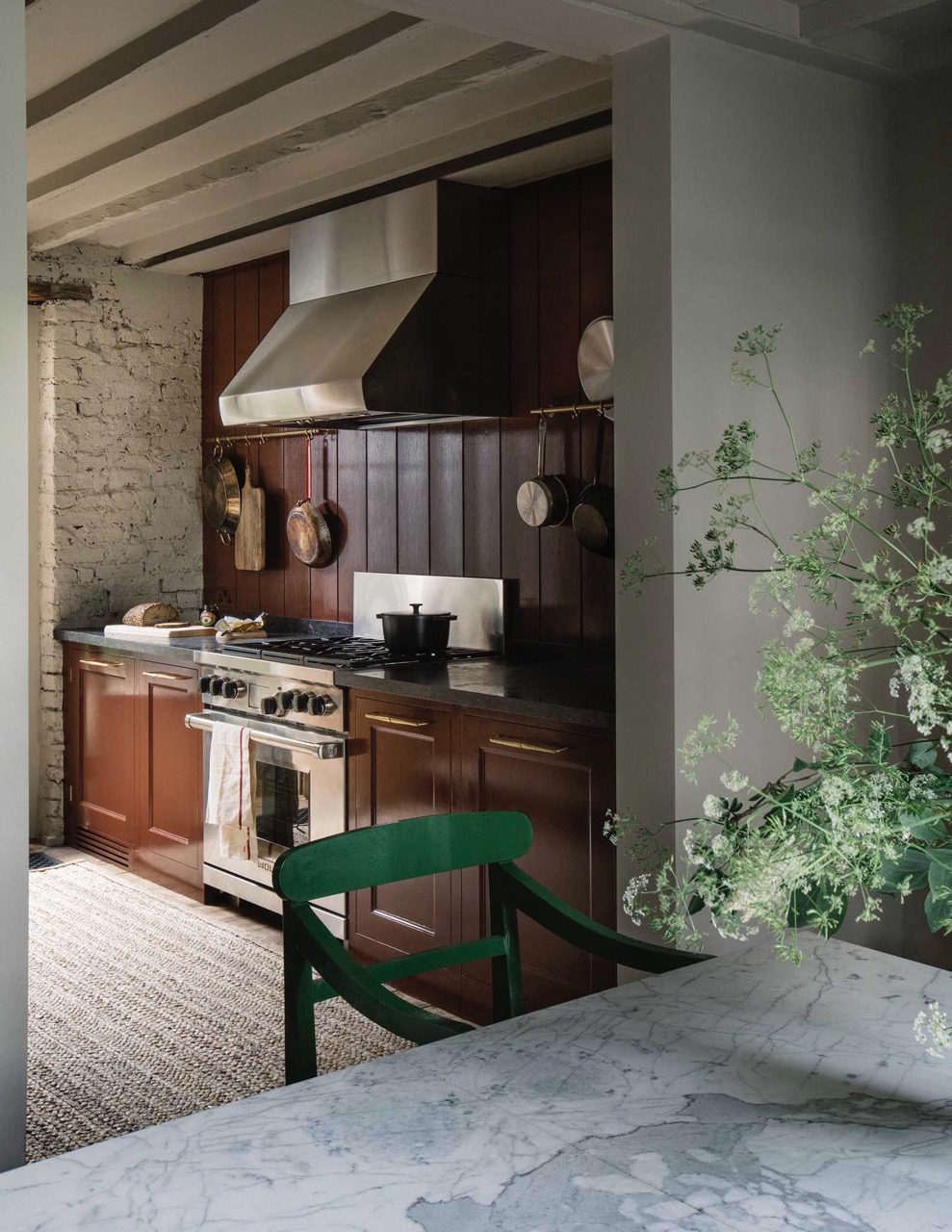
14. Chop
A deeply intense shade of red to be found on the Butchers block. Bake, grill or braise.
View examples
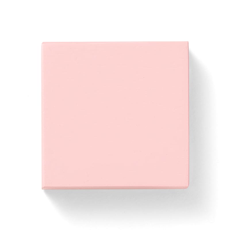
15. Blancmange
The brightest burst of milk on powder. Mix well and transform in to a sumptuous moulded dessert.
View examples
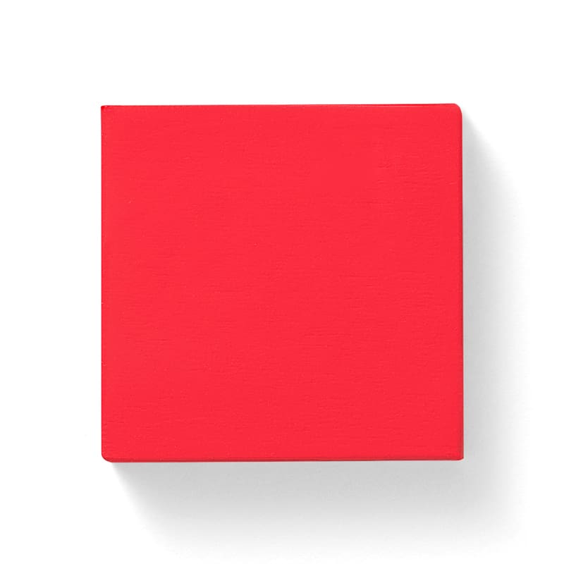
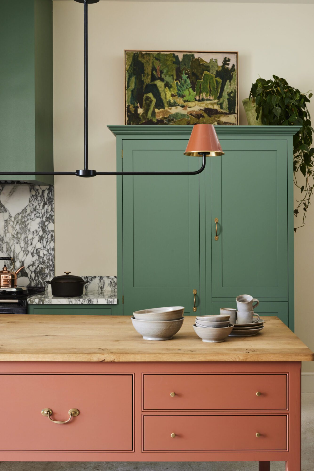
16. Jam
A bright delight, a jewel like droplet of a boiled strawberries, but will it set?
View examples
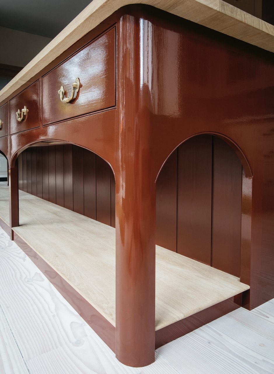
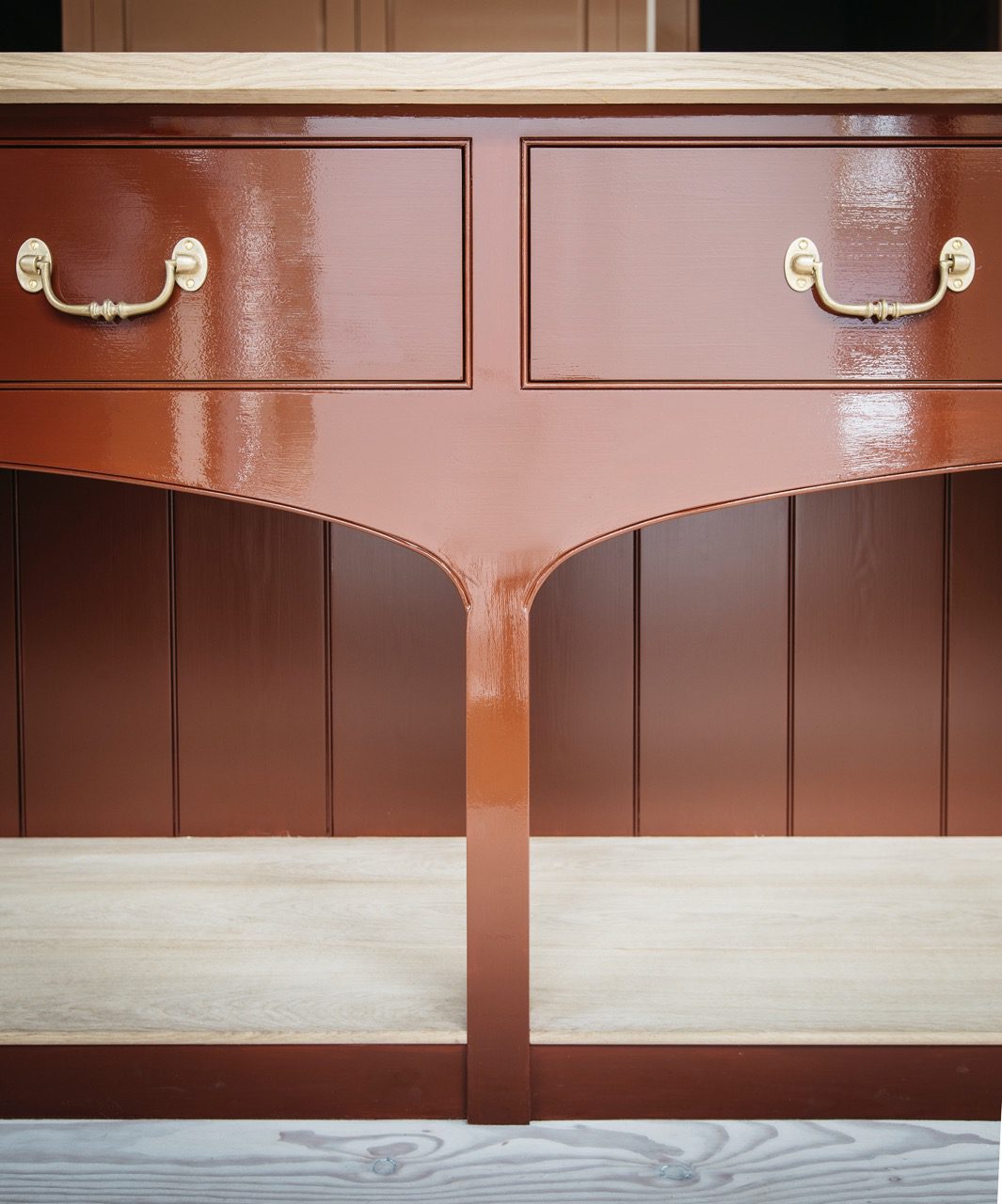
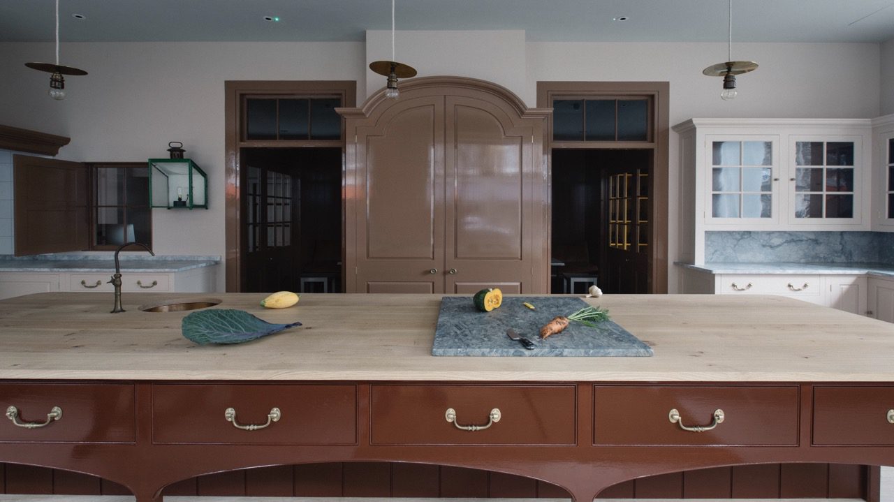
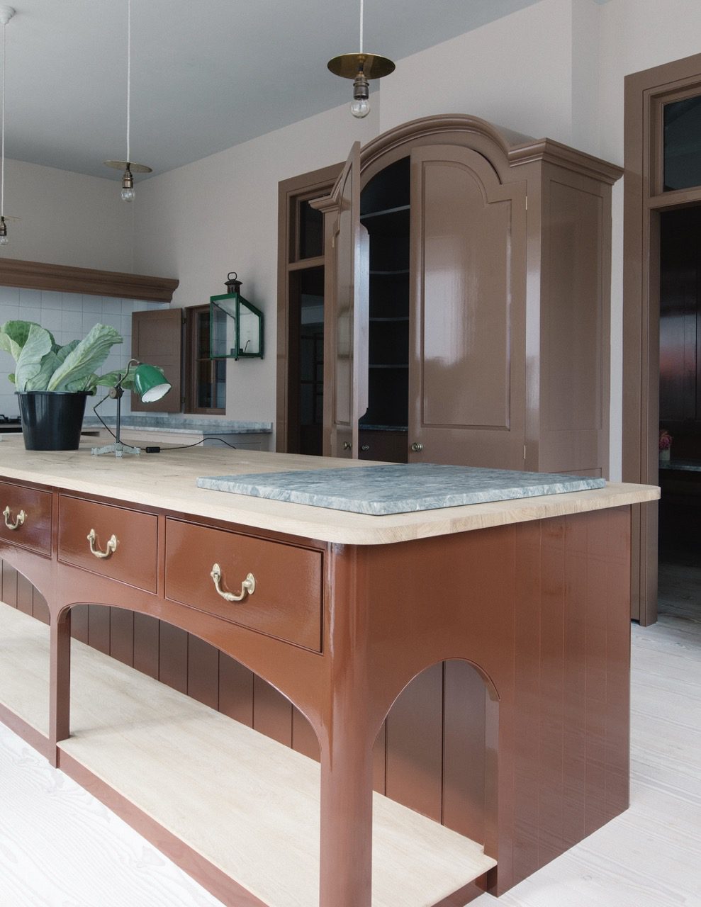
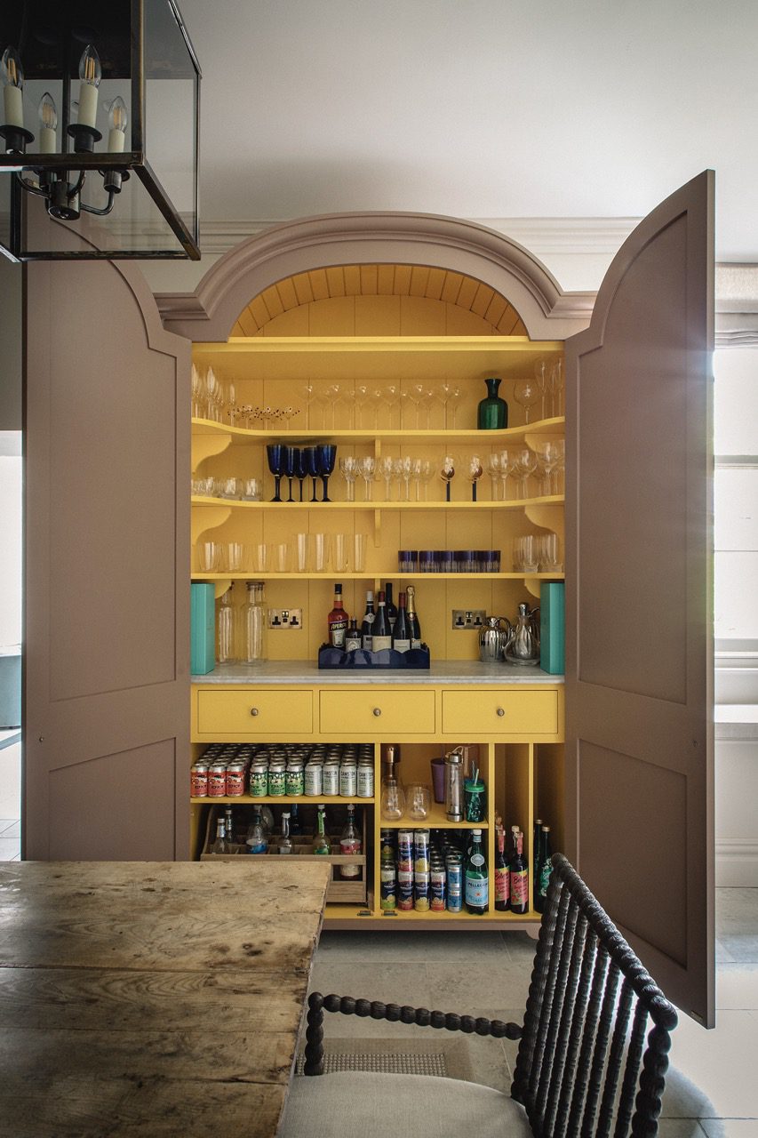
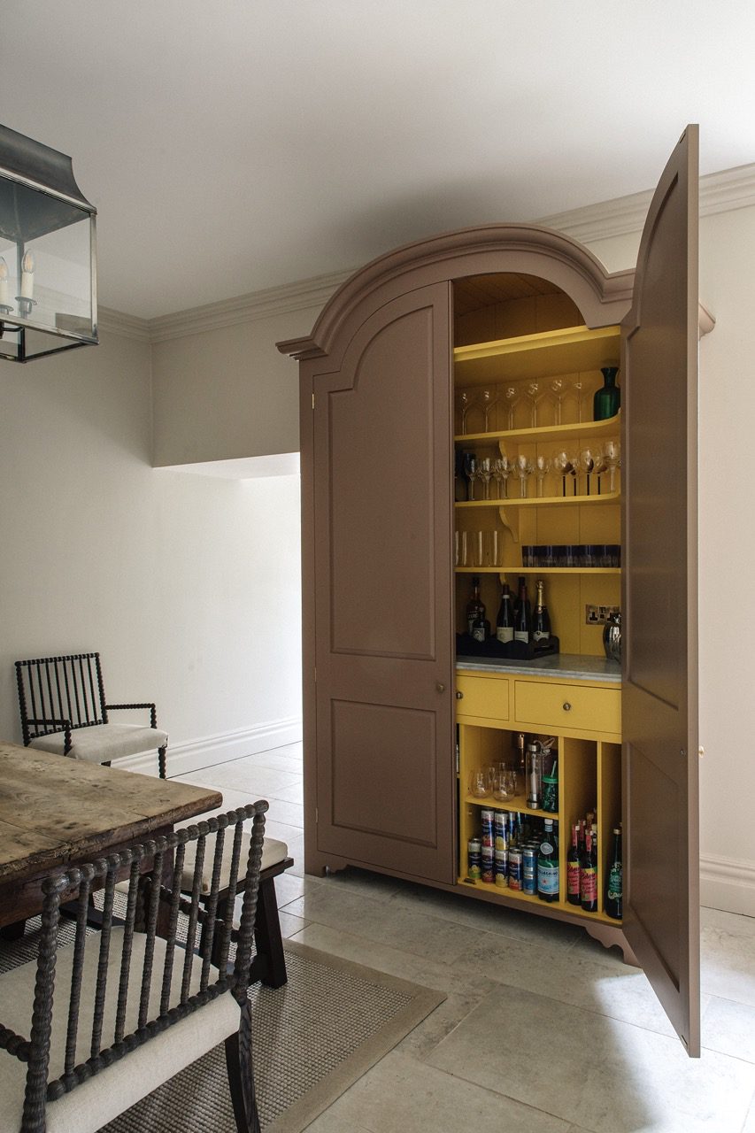
17. Gravy
A smooth, savoury shade, a labour of love when made from scratch.
View examples
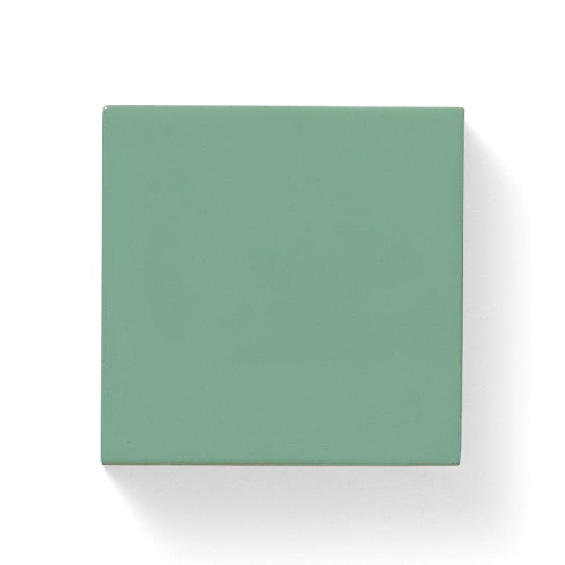
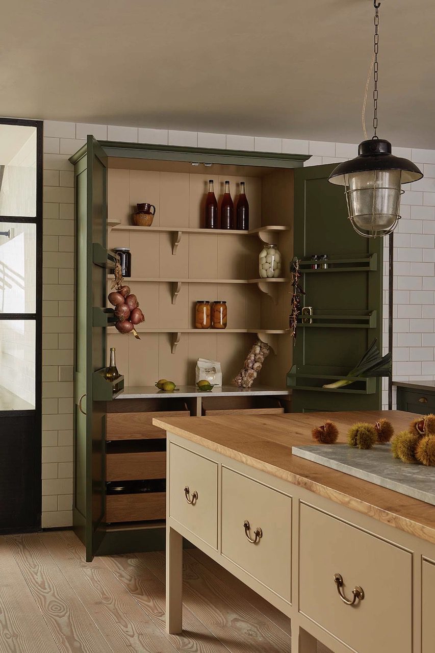
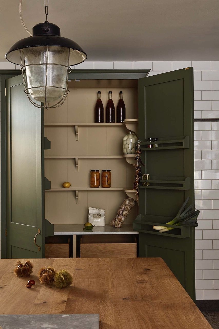
18. Mushy Peas
This starchy green captures the deeply satisfying accompaniment to freshly deep fried fish and chips.
View examples
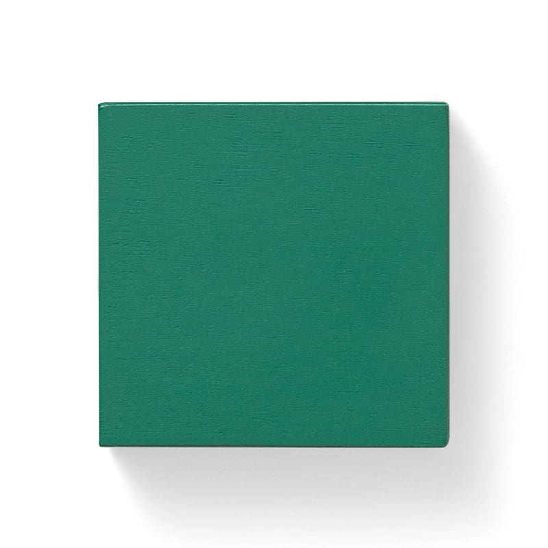
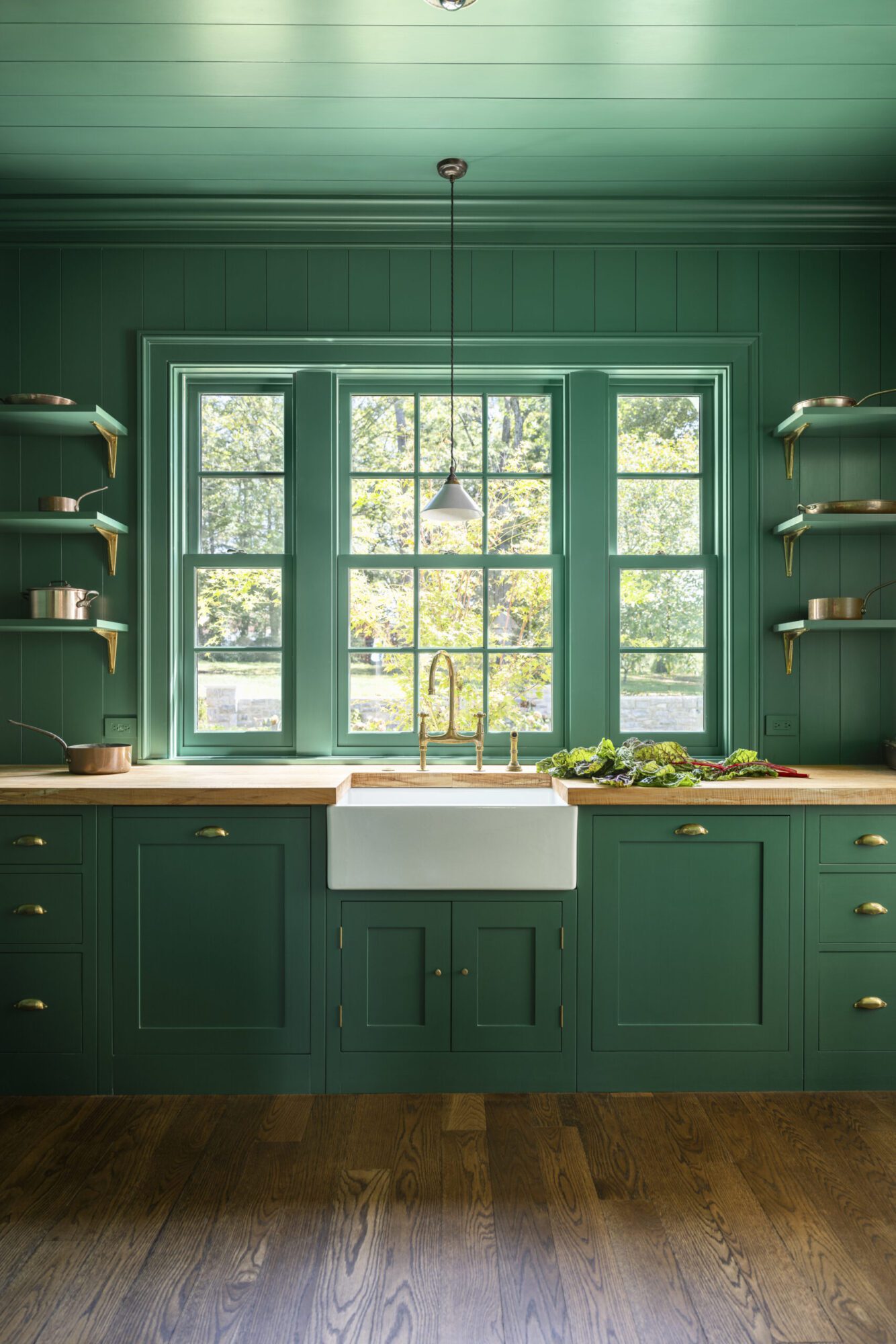
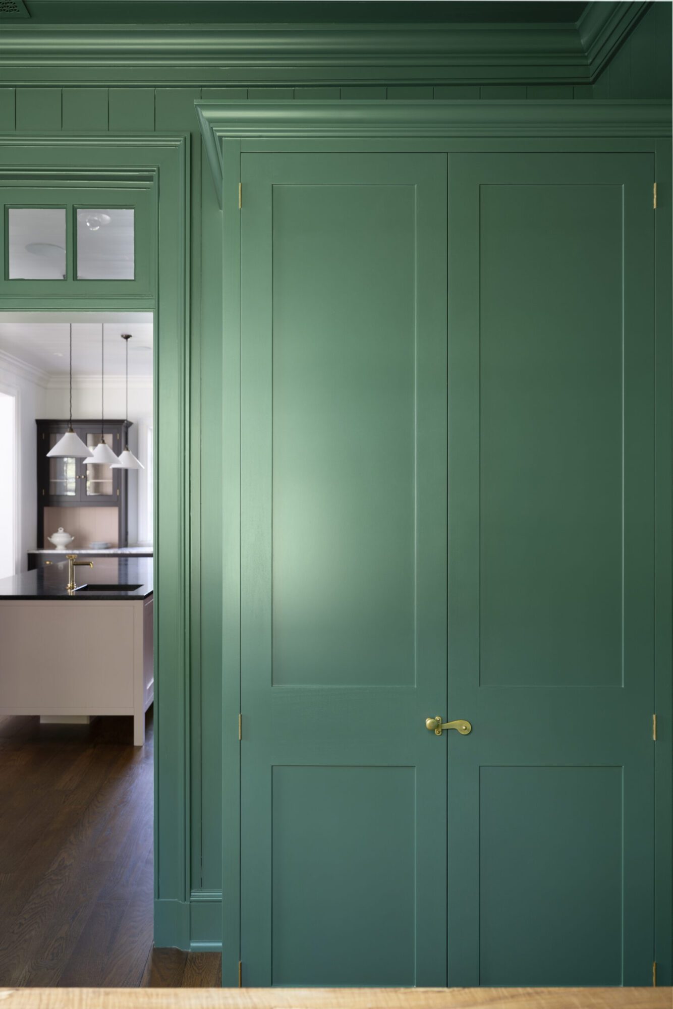
19. Sprouts
A crisp, rich green that surrounds the most polarising of cruciferous vegetables.
View examples

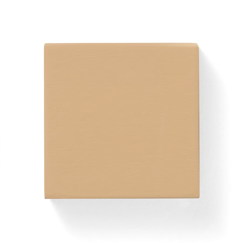
20. Mash
A soft and soothing shade, thick cream with a note of black pepper.
View examples
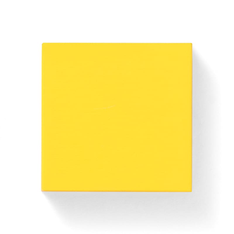
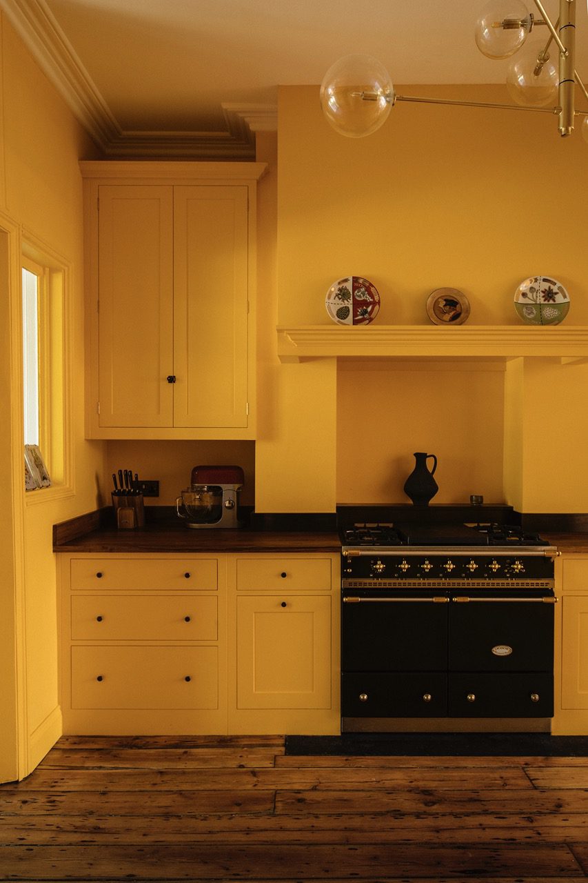
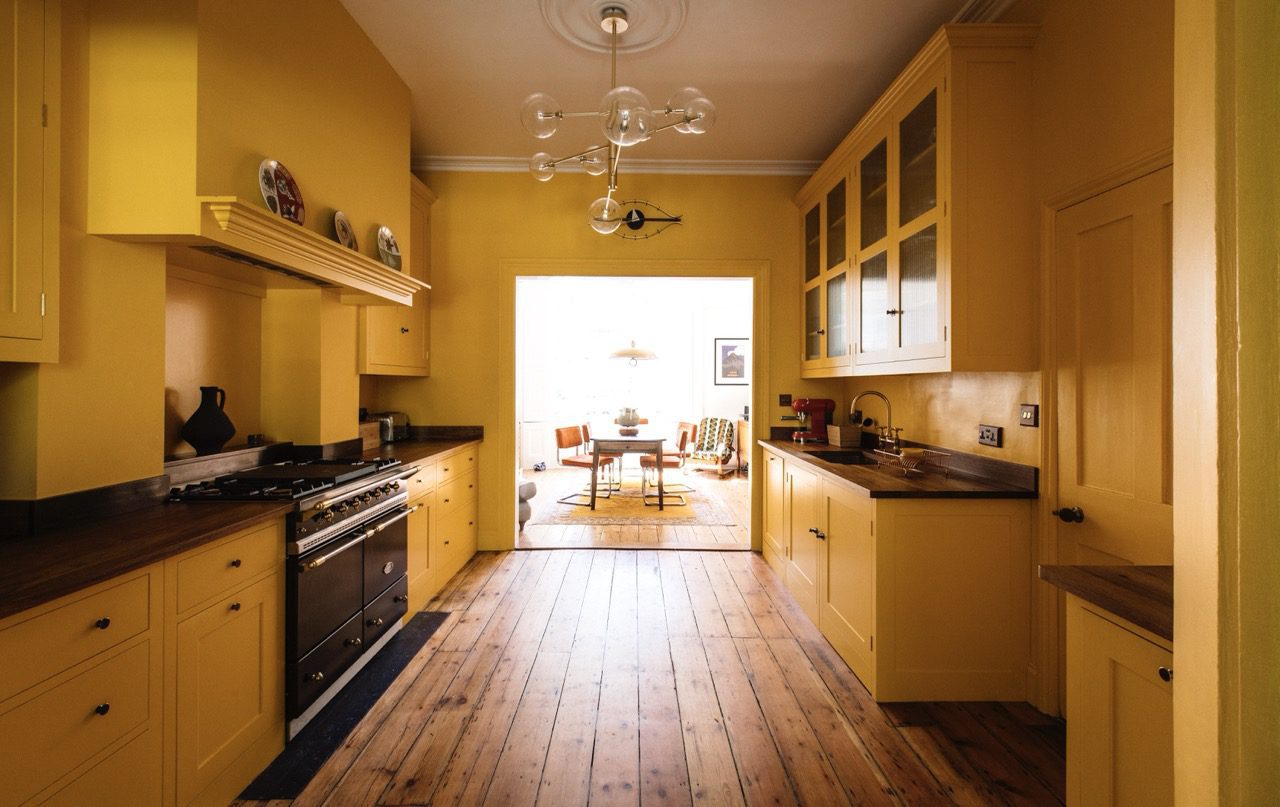
21. Boiled Egg
‘Go to work on an egg’ wrote Fay Weldon. This rich solid hue exudes the sun shiny joy of a good breakfast.
View examples
22. Sauce
Glistening, rich and comforting, this brown to red shade warms the heart and hearth.
View examples
23. Milky Tea
It takes a good whole milk and a well ‘mashed’ breakfast tea to achieve this warm friendly shade.
View examples
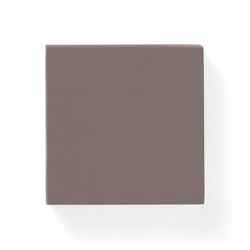
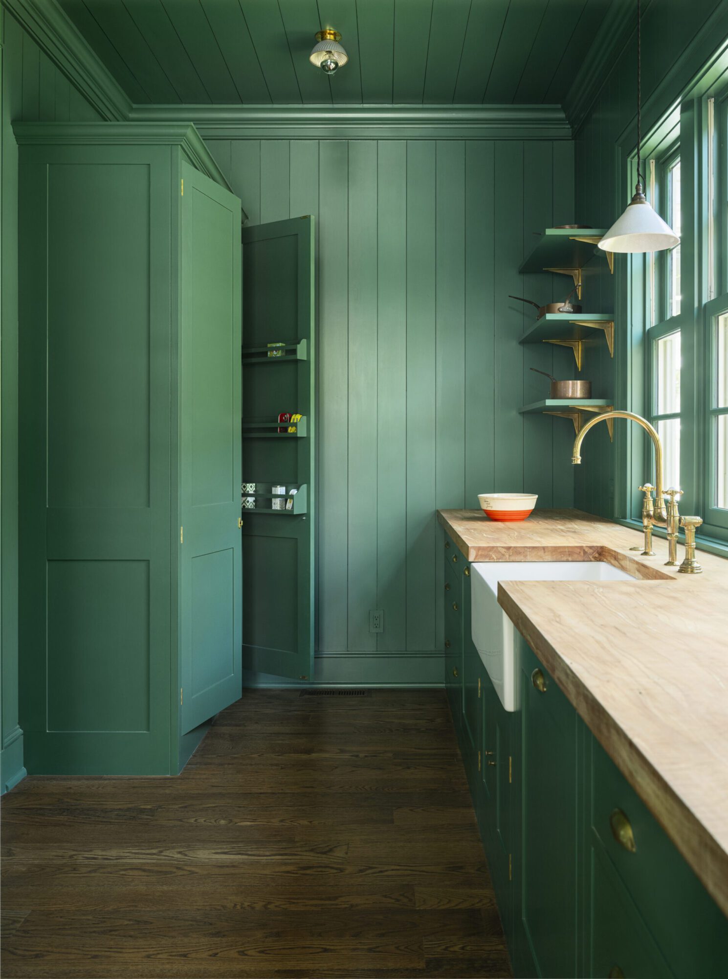
24. Relish
Patum Paterium or Gentleman’s Relish was first created in 1828 by an Englishman, John Osborn. This subtle, yet strong shade, befits the secret recipe.
View examples
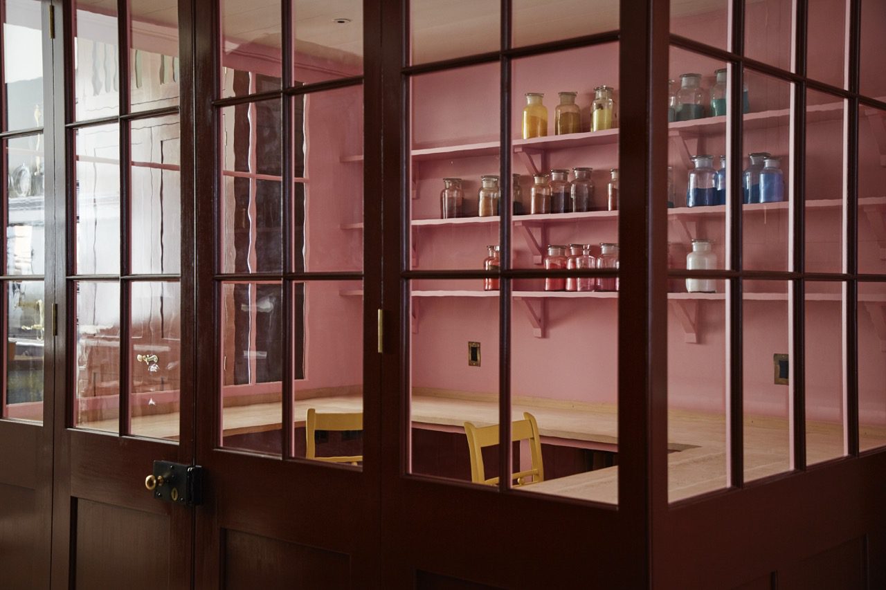
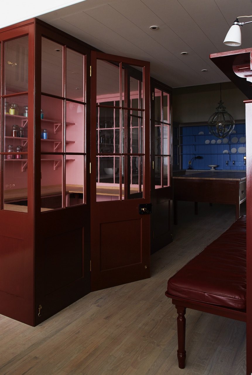
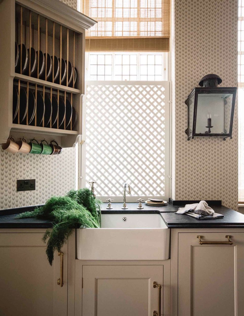
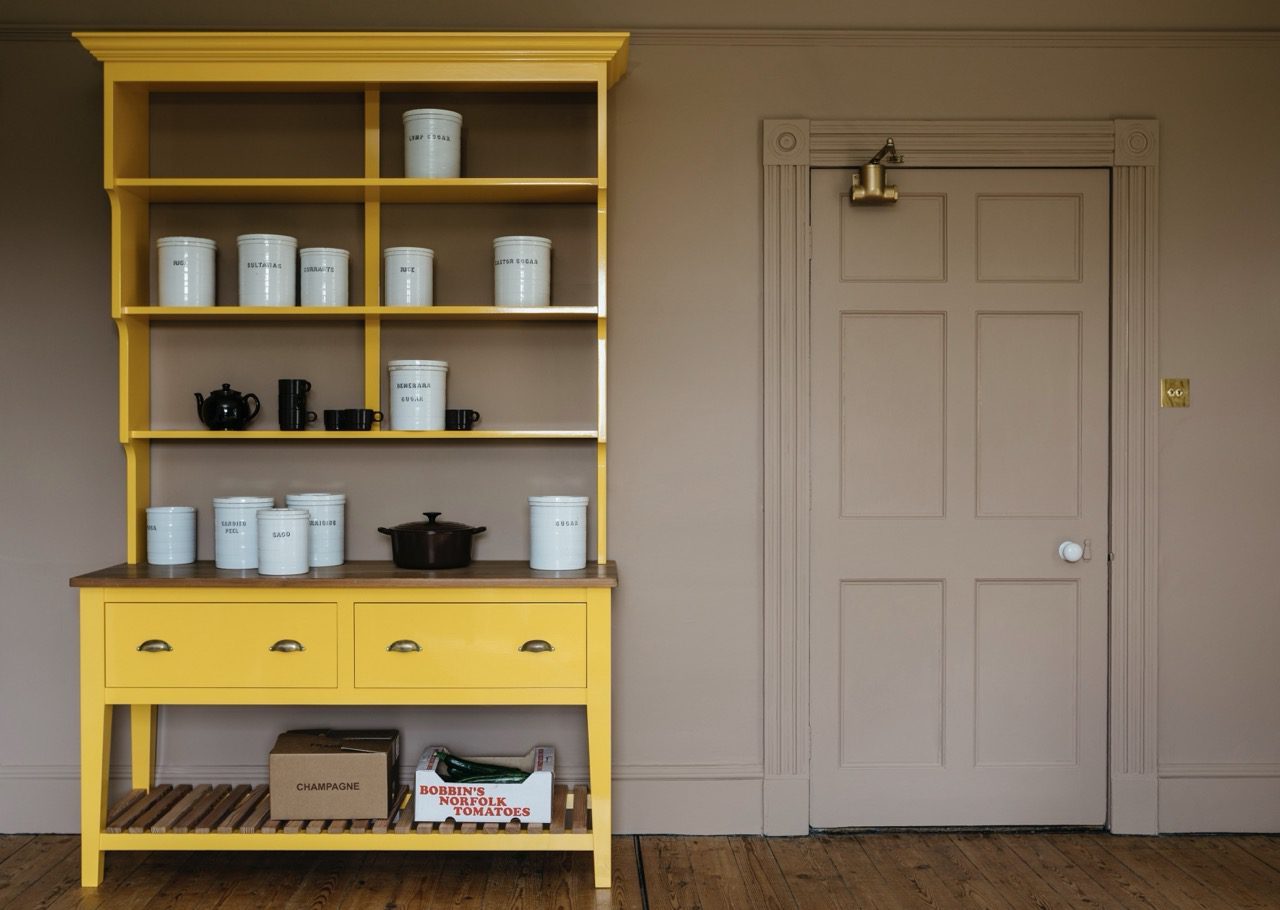
13. Kipper
Our Dutch Larder in our previous showroom, painted in ‘Kipper’.

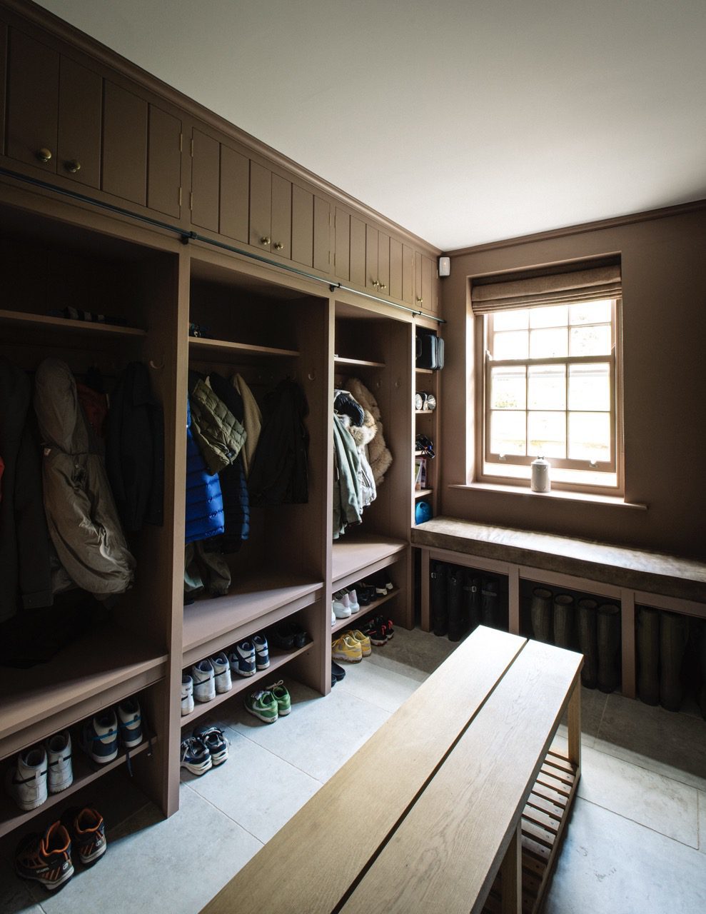
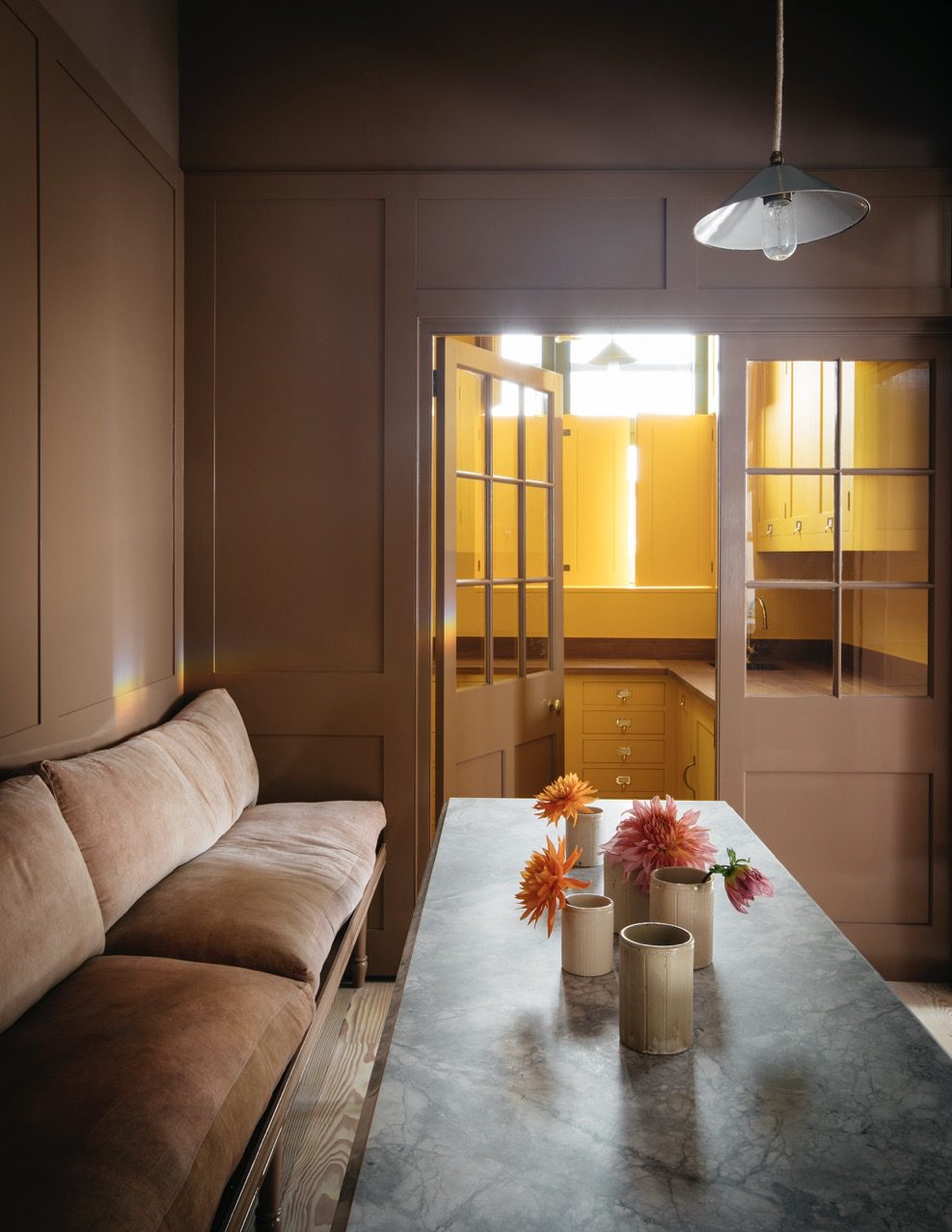
The seating area in our previous showroom painted in ‘Kipper’ with the Butler’s pantry behind painted in ‘Boiled Egg’.
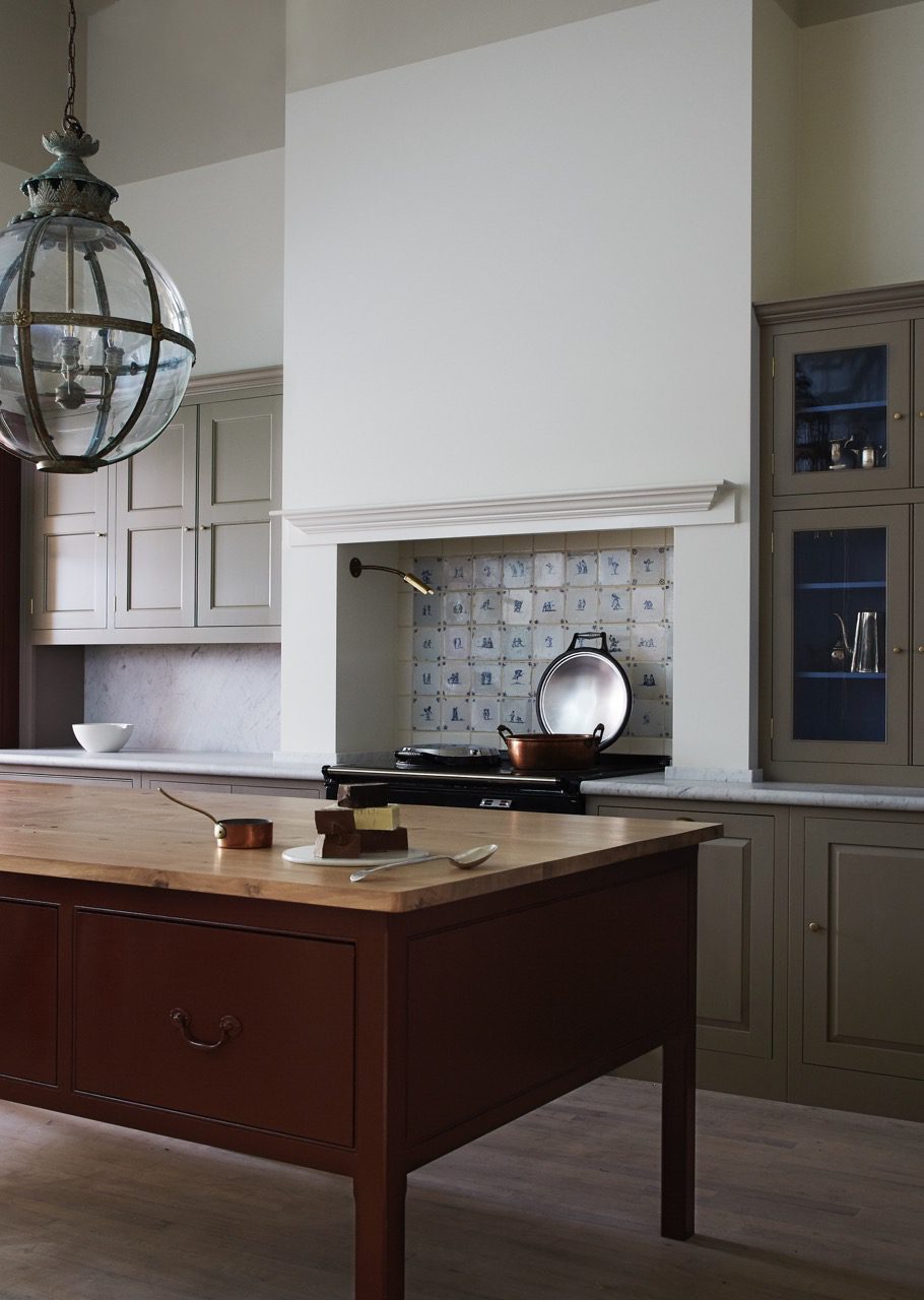
14. Chop
Bath dresser painted in ‘Chop’.
Bath dresser painted in ‘Chop’.
Bath dresser painted in ‘Chop’ with ‘Kipper’ on our Dutch Larder behind. Other cupboards in background painted in ‘Mash’.
Bath dresser painted in ‘Chop’ with ‘Kipper’ on our Dutch Larder behind.
16. Jam
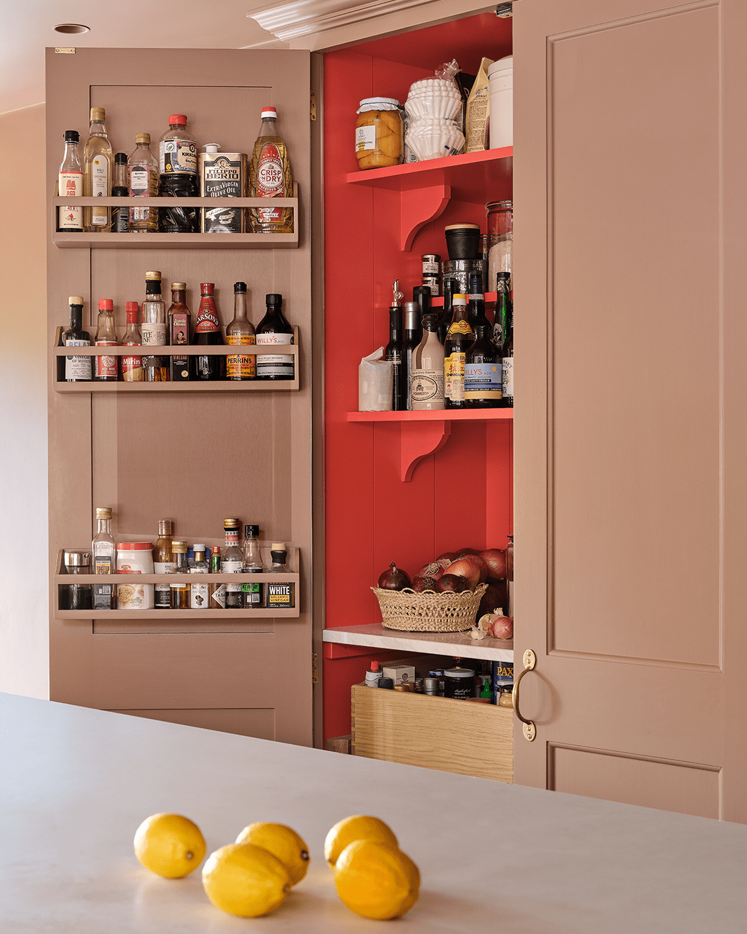
A project with SGS interiors. Larder cupboard interior painted in ‘Jam’ with the exterior painted in ‘Kipper’.
A project with SGS interiors. Chairs painted in ‘Jam’.
17. Gravy
Worktable from our kitchen at Nicky Kehoe in Los Angeles painted in ‘Gravy’. Cupboard in the background painted in ‘Mushy Peas’.
18. Mushy Peas
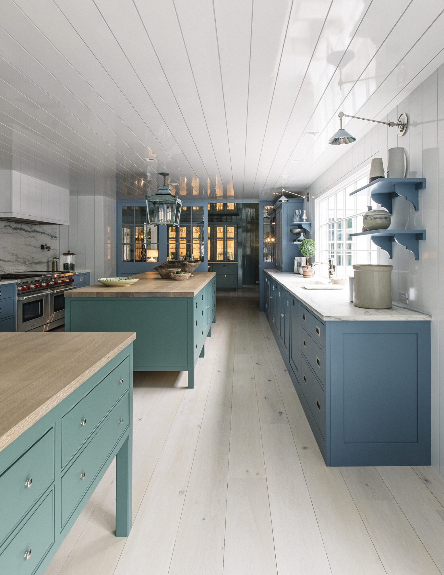
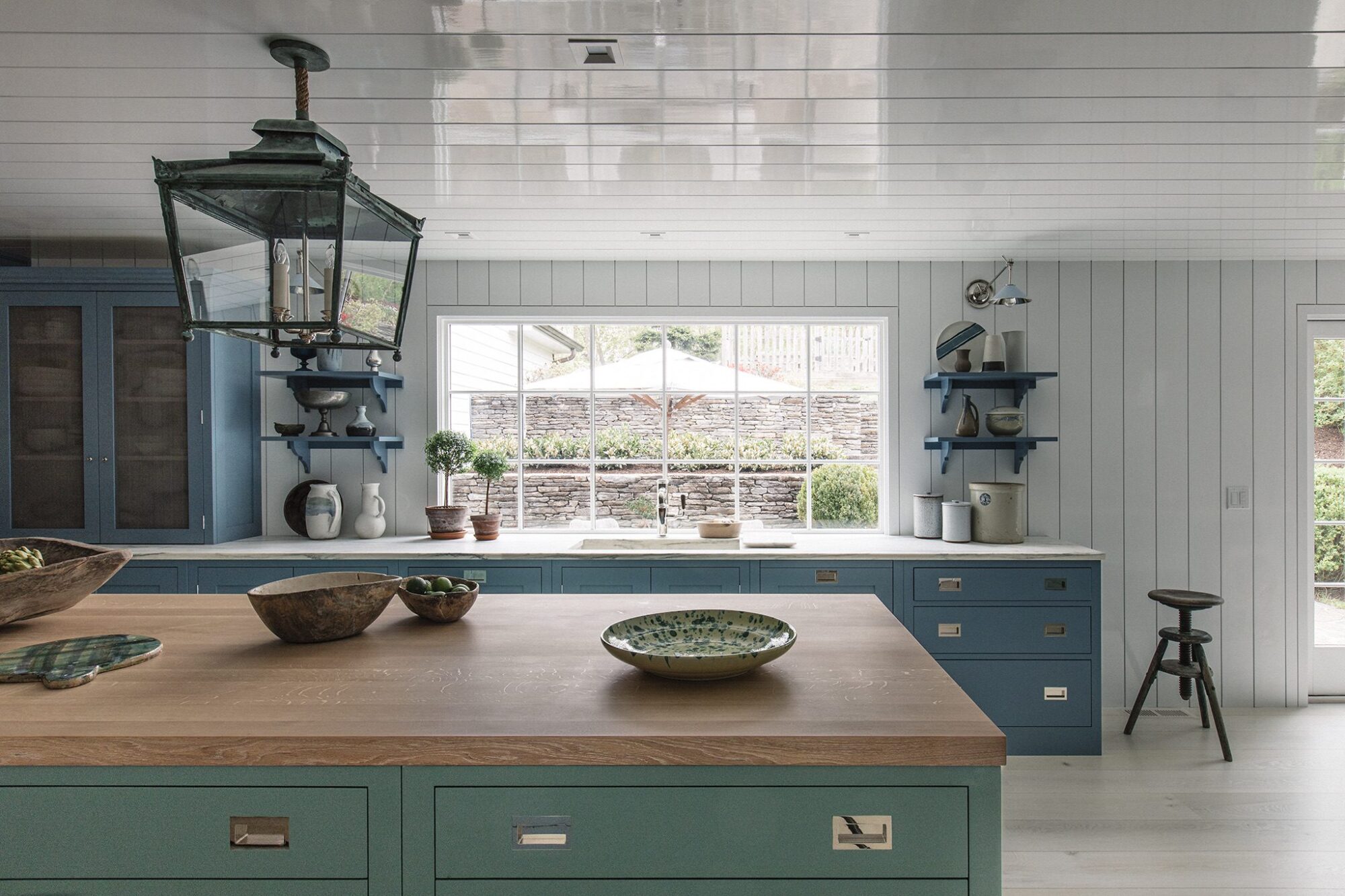
Worktable from our kitchen at Nicky Kehoe in Los Angeles painted in ‘Gravy’. Cupboard in the background painted in ‘Mushy Peas’.
20. Mash
Cupboards in this apartment painted in ‘Mash’.
Cupboards in this apartment painted in ‘Mash’.
Cupboards in this apartment painted in ‘Mash’.
Floor cupboards here painted in ‘Mash’ and our Bath Dresser in 'Chop’.
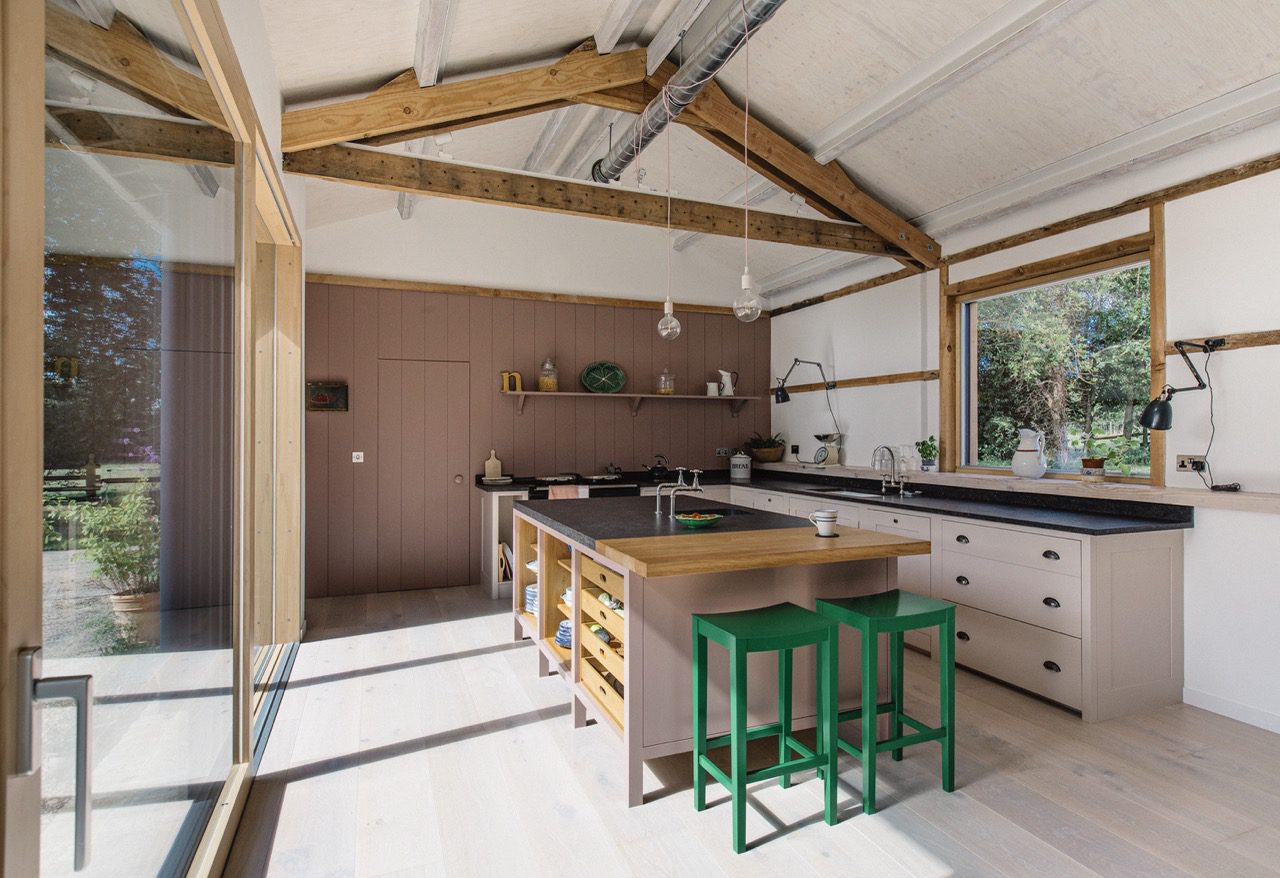
Floor cupboards painted in ‘Mash’ with our stools painted in ‘Pretty Pickle’.
Floor cupboards painted in ‘Mash’ with our stools painted in ‘Pretty Pickle’.
Floor cupboards painted in ‘Mash’ with our stools painted in ‘Pretty Pickle’.
21. Boiled Egg
Victorian Villa colour drenched in 'Boiled Egg'.
Victorian Villa colour drenched in 'Boiled Egg'.
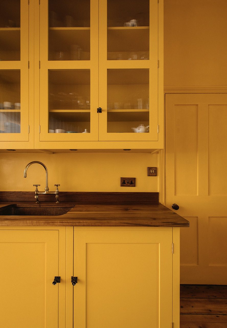
Victorian Villa colour drenched in 'Boiled Egg'.
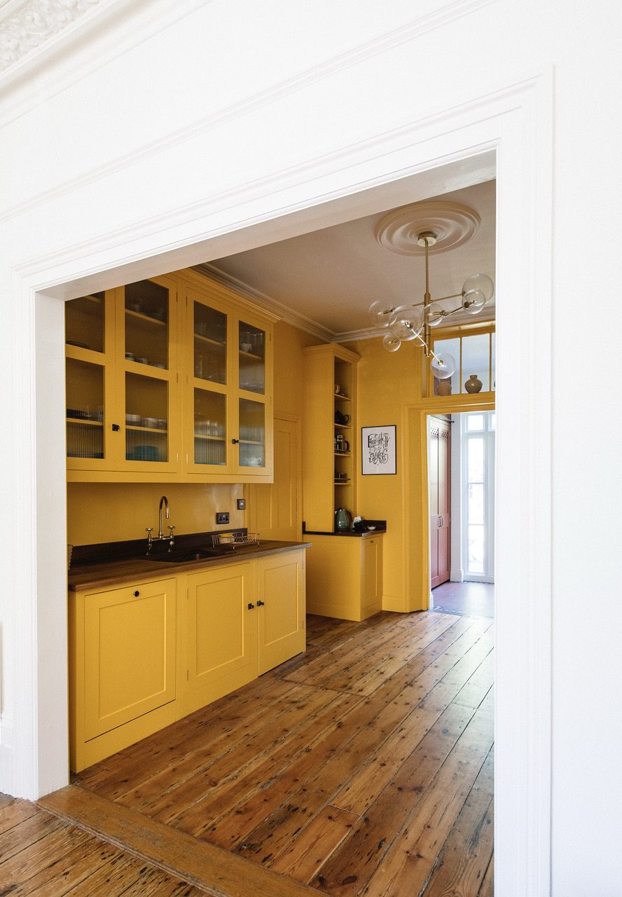
Victorian Villa colour drenched in 'Boiled Egg'.
Pot Board Dresser painted in ‘Boiled Egg’ with wall behind painted in ‘Kipper’.
23. Milky Tea
Inside of the Larder Cupboard painted in ‘Milky Tea’ with the exterior in ‘Dripping Tap’, and the worktable in ‘Rice Pudding’.
Inside of the Larder Cupboard painted in ‘Milky Tea’ with the exterior in ‘Dripping Tap’.
Inside of the Larder Cupboard painted in ‘Milky Tea’ with the exterior in ‘Dripping Tap’.
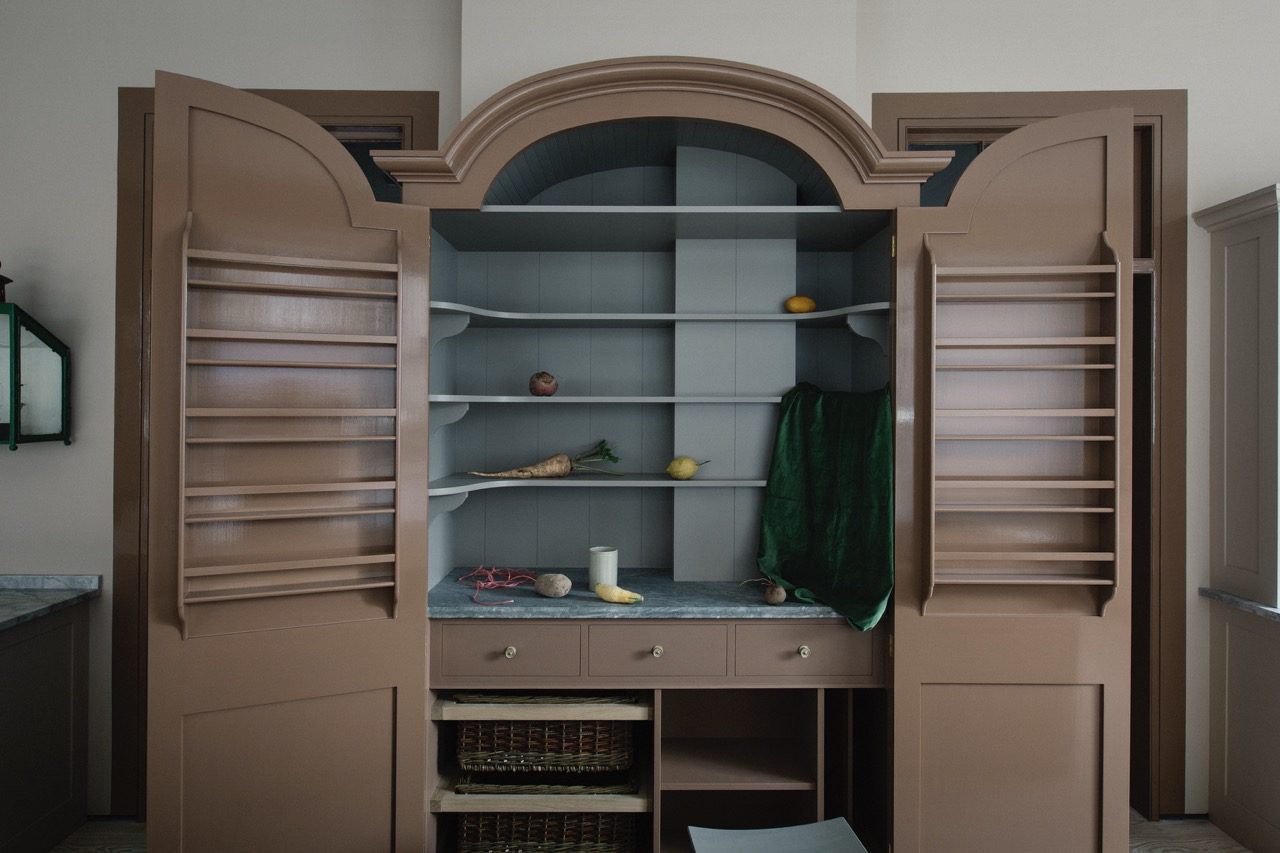
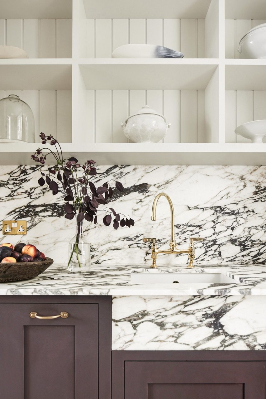
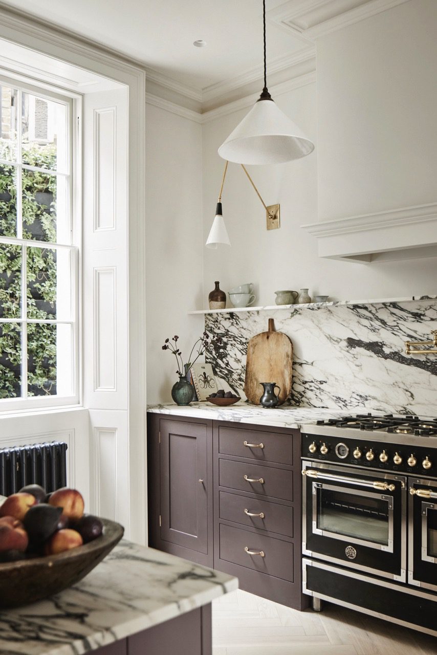
24. Relish
All floor cupboards painted in ‘Relish’.
All floor cupboards painted in ‘Relish’.
All floor cupboards painted in ‘Relish’.
All floor cupboards painted in ‘Relish’.
All floor cupboards painted in ‘Relish’.
All floor cupboards painted in ‘Relish’.